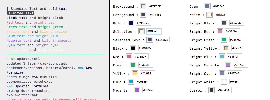
 I really like this
purple/cherry theme but the magenta colour it currently uses is too
close to the text colour. A quick bash listing the files of the home
directory shows that symlinks are displayed in magenta and this is a
problem. Consider an alternative and save the file separately as
Wild Cherry - Edited : always leave the original file as it is.
Hmm. It would seem there are two Wild Cherry themes in the
theme folder. Let’s explore that one too.
I really like this
purple/cherry theme but the magenta colour it currently uses is too
close to the text colour. A quick bash listing the files of the home
directory shows that symlinks are displayed in magenta and this is a
problem. Consider an alternative and save the file separately as
Wild Cherry - Edited : always leave the original file as it is.
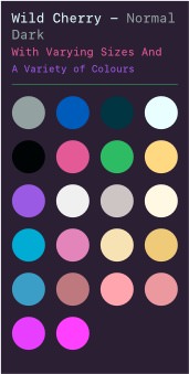
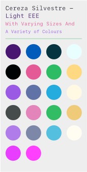
Hmm. It would seem there are two Wild Cherry themes in the
theme folder. Let’s explore that one too.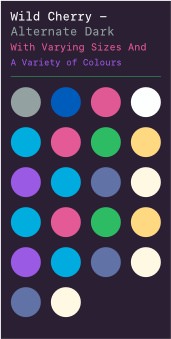 This alternative
version, I think the most up-to-date, has some strange changes compared
to the other. The black colour is blue in both normal and
bright. This leads to some strange looking interfaces in other
terminal applications. The scheme eschews a separate
bright palette which seems to be fairly common amongst other colour
schemes but I have misgivings. The text colour has been changed from a
light blue to straight white (FFF) and lastly the
cursor is now blue rather than magenta.
This alternative
version, I think the most up-to-date, has some strange changes compared
to the other. The black colour is blue in both normal and
bright. This leads to some strange looking interfaces in other
terminal applications. The scheme eschews a separate
bright palette which seems to be fairly common amongst other colour
schemes but I have misgivings. The text colour has been changed from a
light blue to straight white (FFF) and lastly the
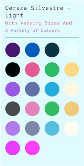
cursor is now blue rather than magenta.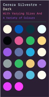 Cereza Silvestre
(wild cherry!) with some minor changes. The terribly light
‘bright’ colours have been replaced with the similar colours from the
alternate theme.
Cereza Silvestre
(wild cherry!) with some minor changes. The terribly light
‘bright’ colours have been replaced with the similar colours from the
alternate theme.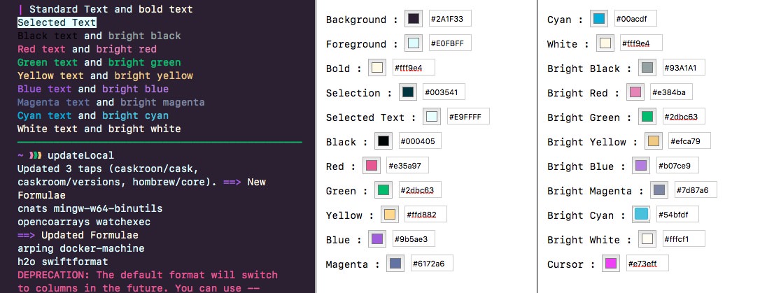
 The light version of
this theme simply reverses the background and foreground resulting in a
somewhat pleasant backdrop. This somewhat pleasant backdrop might not
always be pleasant so let’s fiddle.
The light version of
this theme simply reverses the background and foreground resulting in a
somewhat pleasant backdrop. This somewhat pleasant backdrop might not
always be pleasant so let’s fiddle.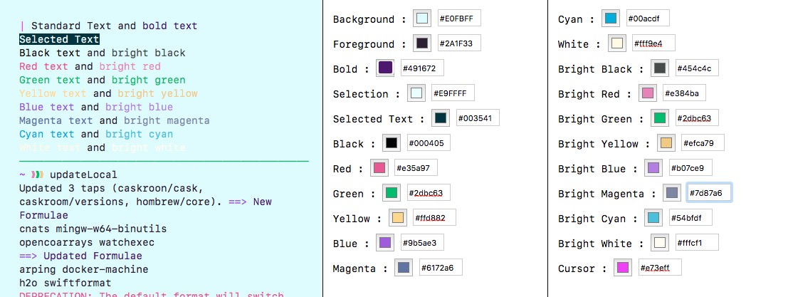
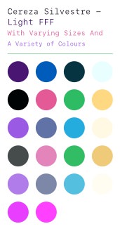 The same as
above but with a stark FFF background.
The same as
above but with a stark FFF background.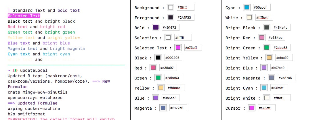
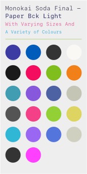
 The same as the
bright version but with a dimmed background taken from
Paper Colour.
The same as the
bright version but with a dimmed background taken from
Paper Colour.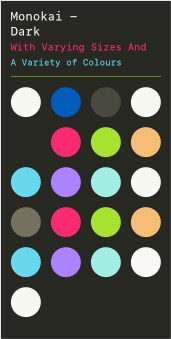 Look specifically at the
blue, magenta and cyan colours and compare
them to Monokai Soda. I would like a different colour
for magenta as at this moment it is the same as
red.
Look specifically at the
blue, magenta and cyan colours and compare
them to Monokai Soda. I would like a different colour
for magenta as at this moment it is the same as
red.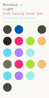 Always difficult to get a
theme that works either light or dark using the same colours. With
Monokai the colours, like green, really pop
against a dark background but are exceedingly difficult to read on a
light backdrop. See what works and what can be taken from this
theme.
Always difficult to get a
theme that works either light or dark using the same colours. With
Monokai the colours, like green, really pop
against a dark background but are exceedingly difficult to read on a
light backdrop. See what works and what can be taken from this
theme.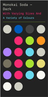 This theme has only been
slightly modified to create the edited version. The main difference is
the swap of blue and cyan. Call me old fashioned but
blue really should be blue rather than purple.
This theme has only been
slightly modified to create the edited version. The main difference is
the swap of blue and cyan. Call me old fashioned but
blue really should be blue rather than purple.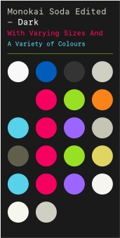 The first thing to
note is the change between the foreground/background colours from the
original theme. Compare and contrast.
The first thing to
note is the change between the foreground/background colours from the
original theme. Compare and contrast.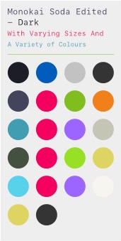 Look at
Paper Colour to see some bolder colours against a light
background.
Look at
Paper Colour to see some bolder colours against a light
background.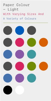 The light terminal theme
to accompany the vim theme. I don’t massively like the
scheme but it does show how one can use colours against a light
background.
The light terminal theme
to accompany the vim theme. I don’t massively like the
scheme but it does show how one can use colours against a light
background.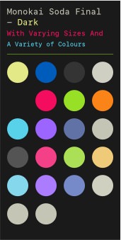 The final colour
scheme for Monokai Soda Dark as noted by the title.
The final colour
scheme for Monokai Soda Dark as noted by the title.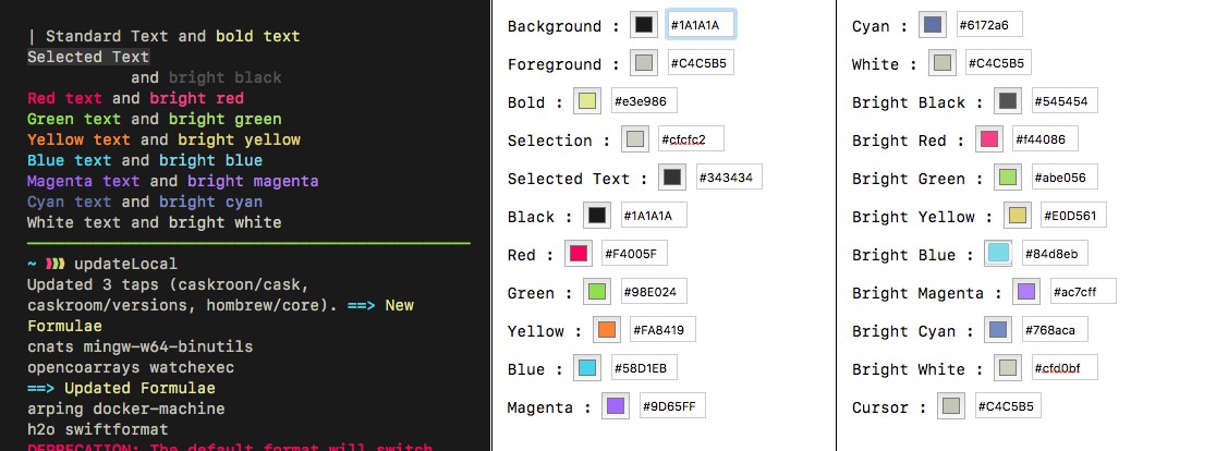
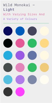
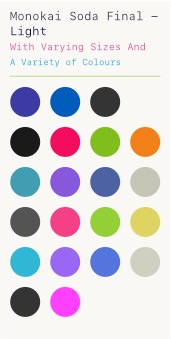 Final Monokai Soda
Light theme with an additional dimmed background version.
Final Monokai Soda
Light theme with an additional dimmed background version.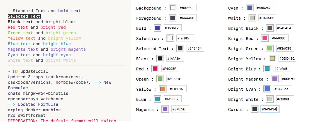
 A dimmed
background for when you want a light theme but not an eye-piercing
one.
A dimmed
background for when you want a light theme but not an eye-piercing
one.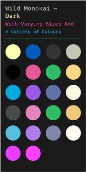 As the name suggests
this is a combination of Monokai Soda & Wild Cherry (perhaps
more pertinetly Cereza Silvestre). The theme takes the background
and foreground of Monokai Soda and the colours of Wild Cherry. A light
theme is provided.
As the name suggests
this is a combination of Monokai Soda & Wild Cherry (perhaps
more pertinetly Cereza Silvestre). The theme takes the background
and foreground of Monokai Soda and the colours of Wild Cherry. A light
theme is provided.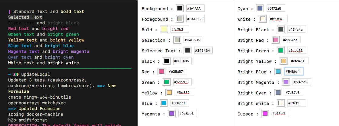
 The light theme with a
modicum of tinkering to try and balance the colours against the
backdrop.
The light theme with a
modicum of tinkering to try and balance the colours against the
backdrop.