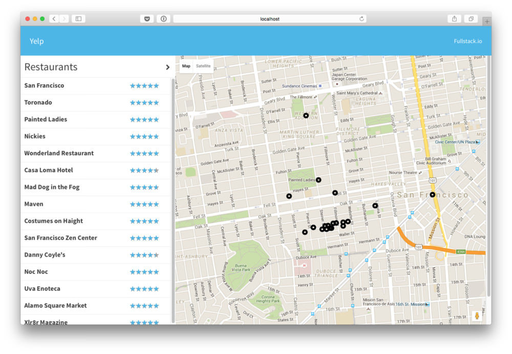
tl;dr - This post will guide you through building a full React app, even with little to no experience in the framework. We’re going build a Yelp clone in React
You can get the completed code here
Download the first chapter of our React Book (for free)
Let’s build a lightweight clone of Yelp using React.
In this tutorial we’ll talk about:
postcssreact-routerWe’ll be tying in a lot of different pieces of React together to build a full-sized React app. This post will guide you through building a full React app, even with little to no experience in the framework.
Let’s buckle up and get building.
One of the most painful parts of building a React app is building the boilerplate. We have so many choices we can make to start building our application, it can be overwhelming how to even get started. We’re going to be building our application using a few tools that we find useful as well and help us build our production apps here at Fullstack.io.
Check out the final version of the
package.jsonand thewebpack.config.json github at github.com/fullstackreact/react-yelp-clone
While there are a ton of great boilerplates you can use, often times using a boilerplate can be more confusing than setting things up yourself. In this post we’re going to install everything directly and so this should give you a good idea about how to start a new project from scratch on your own.
To skip the process of setting up the app, use the yeoman generator to build the entire setup process and skip directly to routing. Installation:
npm install -g yo generator-react-genRun it with:
yo react-gen
Throughout this process, we’ll use some JavaScript features of ES6, inline css modules, async module loading, tests, and more. We’ll use webpack for it’s ease of babel implementation as well as a few other convenient features it provides.
In order to follow along with this process, ensure you have node.js installed and have
npmavailable in your$PATH. If you’re not sure if you havenpmavailable in$PATH,
This is the folder structure we’ll be building towards:
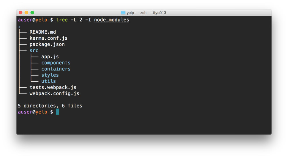
Let’s create a new node project. Open a terminal and create the beginning of our folder structure:
mkdir yelp && cd $_
mkdir -p src/{components,containers,styles,utils,views}\
  && touch webpack.config.js
In the same directory, let’s create our node project by using the
npm init command and answering a few questions about the
project. After this command finishes, we’ll have a
package.json in the same directory, which will allow us to
define a repeatable process for building our app.
It doesn’t quite matter how we answer the questions at this point, we can always update the
package.jsonto reflect changes.Additionally, instead of the command
npm init, we can usenpm init -yto accept all the defaults and not answer any questions.
npm init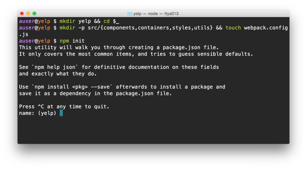
We’ll need a few dependencies to get started.
TLDR; Install the dependencies in each of the code sample sections.
Before we can start building our app, we’ll need to set up our build
chain. We’ll use a combination of npm and some
configuration files.
Babel is a JavaScript compiler that allows us to use the next generation JavaScript today. Since these features are not only convenient, but they make the process of writing JavaScript more fun.
Let’s grab babel along with a few babel presets. In the same
directory as the package.json, let’s install our
babel requirements:
npm install --save-dev babel-core babel-preset-es2015 babel-preset-react babel-preset-react-hmre babel-preset-stage-0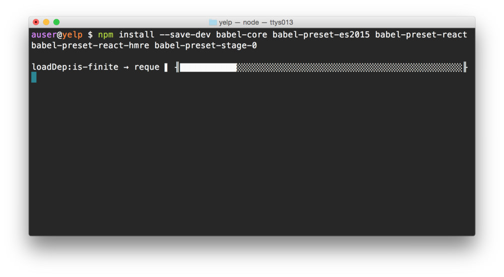
We’ll need to configure babel so our application will compile.
Configuring babel is easy and can be set up using a file called
.babelrc at the root of the project (same place as our
package.json) file.
touch .babelrcLet’s include a few presets so we can use react as well as the react hot reloading features:
  {
    "presets": ["es2015", "stage-0", "react"]
  }
Babel allows us to configure different options for different
operating environments using the env key in the babel
configuration object. We’ll include the babel-hmre preset
only in our development environment (so our production bundle doesn’t
include the hot reloading JavaScript).
{
  "presets": ["es2015", "stage-0", "react"],
  "env": {
    "development": {
      "presets": ["react-hmre"]
    }
  }
}
Let’s even expand this even further by defining our full production/test environments as well:
{
  "presets": ["es2015", "stage-0", "react"],
  "env": {
    "development": {
      "presets": ["react-hmre"]
    },
    "production": {
      "presets": []
    },
    "test": {
      "presets": []
    }
  }
}Setting up webpack can be a bit painful, especially without having a previous template to follow. Not to worry, however! We’ll be building our webpack configuration with the help of a well-built webpack starter tool called hjs-webpack.
The hjs-webpack build tool sets up common loaders for both development and production environments, including hot reloading, minification, ES6 templates, etc.
Let’s grab a few webpack dependencies, including the hjs-webpack package:
npm install --save-dev hjs-webpack webpackWebpack is a tad useless without any loaders or any configuration set. Let’s go ahead and install a few loaders we’ll need as we build our app, including the babel-loader, css/styles, as well as the the url and file loaders (for font-loading, built-in to hjs-webpack):
npm install --save-dev babel-loader css-loader style-loader postcss-loader url-loader file-loader
In our webpack.config.js at the root directory, let’s
get our webpack module started. First, let’s get some require statements
out of the way:
const webpack = require('webpack');
const fs      = require('fs');
const path    = require('path'),
      join    = path.join,
      resolve = path.resolve;

const getConfig = require('hjs-webpack');
The hjs-webpack package exports a single function that
accepts a single argument, an object that defines some simple
configuration to define a required webpack configuration. There are only
two required keys in this object:
var config = getConfig({
  in: join(__dirname, 'src/app.js'),
  out: join(__dirname, 'dist')
})
The hjs-webpack includes an option called
clearBeforeBuild to blow away any previously built files
before it starts building new ones. We like to turn this on to clear
away any strangling files from previous builds.
var config = getConfig({
  in: join(__dirname, 'src/app.js'),
  out: join(__dirname, 'dist'),
  clearBeforeBuild: true
})
Personally, we’ll usually create a few path variables to help us optimize our configuration when we start modifying it from it’s default setup.
const root    = resolve(__dirname);
const src     = join(root, 'src');
const modules = join(root, 'node_modules');
const dest    = join(root, 'dist');

var config = getConfig({
  in: join(src, 'app.js'),
  out: dest,
  clearBeforeBuild: true
})
Now, the hjs-webpack package sets up the environment
specific (dev vs prod) configuration using the first argument value
process.argv[1], but can also accept an option to define if
we’re working in the development environment called
isDev.
A development environment sets up a server without minification and
accepts hot-reloading whereas a production one does not. Since we’ll use
the value of isDev later in our configuration, we’ll
recreate the default value in the same method. Alternatively, we can
check to see if the NODE_ENV is ‘development’:
const NODE_ENV = process.env.NODE_ENV;
const isDev = NODE_ENV === 'development';
// alternatively, we can use process.argv[1]
// const isDev = (process.argv[1] || '')
//                .indexOf('hjs-dev-server') !== -1;

// ...
var config = getConfig({
  isDev: isDev,
  in: join(src, 'app.js'),
  out: dest,
  clearBeforeBuild: true
})
Webpack expects us to export a configuration object from the
webpack.config.js file, otherwise it won’t have access to
the config variable. We can export the config
object by adding the module.exports at the end of the
file:
// ...
var config = getConfig({
  // ...
})

module.exports = config;
We’ll come back to modifying the configuration file shortly as we get a bit further along and need some more configuration. For the time being, let’s get our build up and running.
Check out the final version of the webpack.config.js.
In order to actually build a react app we’ll need to include the react dependency. Unlike the previous dependencies, we’ll include react (and it’s fellow react-dom) as an app dependency, rather than a development dependency.
npm install --save react react-domWe’ll also install react router to handle some routing for us as we’ll have multiple routes in our app, including a map place as well as details page for finding more details about each place we’ll list.
npm install --save react-routerA handy shortcut for installing and saving dependencies with the
npm command:
npm i -S [dependencies]The previous command could be rewritten as:
npm i -S react react-domTo install and save development dependencies, change the
-S to -D, i.e.:
npm i -D [dependencies]
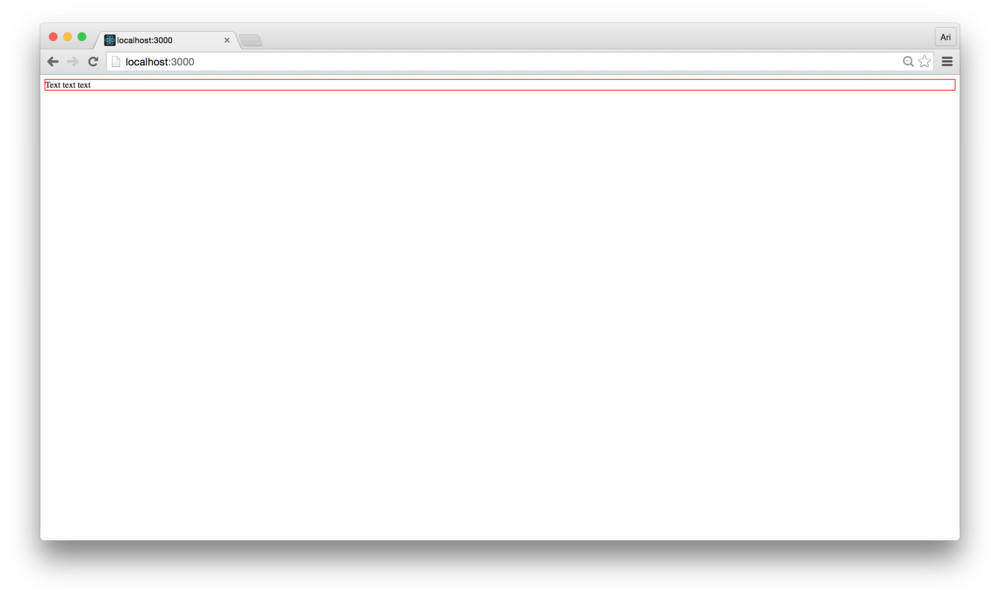
app.jsWe can’t start building our application without an entry file (as we added in the webpack configuration above). We’ll come back to build our React app with a real app container, but let’s make sure our server and build process are working up through this point.
Let’s first start by setting up our app.js with a dummy
react app. Create a file called src/app.js.
touch src/app.jsIn this file, let’s create a simple React container to house a single component with some random text. First, including the dependencies that webpack will bundle in our completed application bundle:
import React from 'react'
import ReactDOM from 'react-dom'

const App = React.createClass({
  render: function() {
    return (<div>Text text text</div>);
  }
});app.jsWe’ll need to mount the <App /> component on the
page before we can see it working. In order to mount the application on
the page, we’ll need a DOM node reference to actually set it up, but
where?
The hjs-webpack package includes a minimal
index.html it will generate if we don’t describe a custom
one (using the html key in the configuration object). We
won’t need to generate a custom html file here, so instead we’ll use the
basic generated page. The default template includes a
<div /> component with an id of root
just for the purpose of setting up a Single Page App (SPA, for
short).
Let’s grab a hold of the DOM node with the id of root and render our
basic <App /> React component inside of it. Our
complete src/app.js file should look like:
import React from 'react'
import ReactDOM from 'react-dom'

const App = React.createClass({
  render: function() {
    return (<div>Text text text</div>)
  }
});

const mountNode = document.querySelector('#root');
ReactDOM.render(<App />, mountNode);
With the src/app.js in place, let’s boot up the server.
The hjs-webpack package installs one for us by default in
the ./node_modules directory. We can refer directly to it
to start the server:
NODE_ENV=development ./node_modules/.bin/hjs-dev-serverIt’s usually a good idea to explicitly set the NODE_ENV,
which we do here.
The server will print out a message about the url we can visit the
app at. The default address is at http://localhost:3000. We’ll head to our browser (we’ll
use Google Chrome) and go
to the address http://localhost:3000.
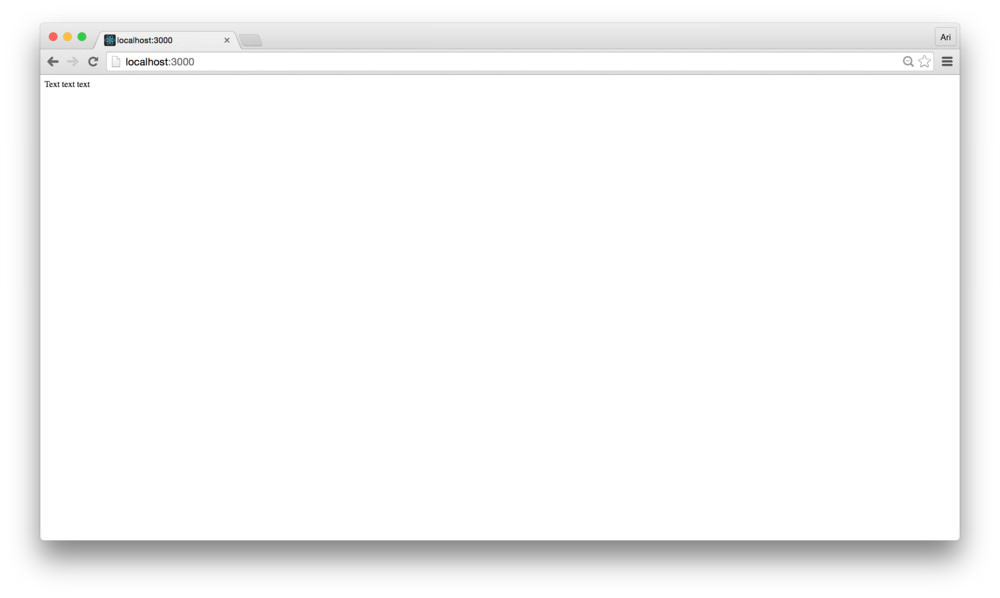
Although it’s not very impressive, we have our app booted and running along with our build process.
To stop the devServer, use
Ctrl+C.
It can be a pain to remember how to start our development server.
Let’s make it a tad easier by adding it as a script to our
package.json.
The package.json has an entry that allows us to add
scripts, not surprisingly called the scripts key. Let’s go
ahead and add a start script in our package.json.
{
  "name": "yelp",
  "version": "1.0.0",
  "description": "",
  "scripts": {
    "start": "NODE_ENV=development ./node_modules/.bin/hjs-dev-server",
    "test": "echo \"Error: no test specified\" && exit 1"
  },
  /* ... */
}
With the start script configured in the scripts key,
instead of using the binary directly we can call
npm run start to start the server.
The start and test scripts in a
package.json file are special scripts and with either one
of these defined, we can leave out the run in the
npm run start command.
I.e. npm start.
All other scripts require the run command to be
executed.
postcssLet’s finish off our configuration of our app process by setting up some styles configuration with postcss and CSS modules.
PostCSS is a pre/post CSS processor. Similar to lesscss and sass, postcss presents a modular interface for programmatically building CSS stylesheets. The community of plugins and preprocessors is constantly growing and gives us a powerful interface for building styles.
Setting postcss in our webpack configuration already works
and hjs-webpack will already include one loader if we have
it installed, the autoprefixer. Let’s
go ahead and install the autoprefixer package:
npm install --save-dev autoprefixerWe’ll use a few other postcss preprocessors in our postcss build chain to modify our CSS. The two we’ll use is the precss package, which does a fantastic job at gluing a bunch of common postcss plugins together and cssnano, which does the same for minification and production environments.
npm i -D precss cssnano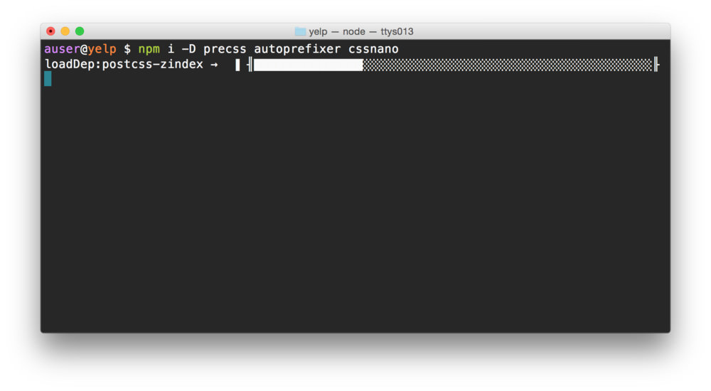
The hjs-webpack only automatically configures the autoprefixer package, not either one of ours, so in order to use these two packages, we’ll need to modify our webpack configuration so webpack knows we want to use them.
At it’s core, the hjs-webpack tool creates a webpack configuration
for us. If we want to extend it or modify the config it generates, we
can treate the return value as a webpack config object. We’ll modify the
config object returned with any updates to the config
object.
The postcss-loader expects to find a
postcss key in the webpack config object, so we can just
prepend and append our postcss modifiers to the
config.postcss array.
// ...
var config = getConfig({
  // ...
})

config.postcss = [].concat([
  require('precss')({}),
  require('autoprefixer')({}),
  require('cssnano')({})
])
Each of the postcss plugins is exported as a function that returns a postcss processor, so we can have a chance to configure it. We’re not including any modification to the setup here, but it’s possible. For documentation on each one, check the documentation for each plugin: - precss - autoprefixer - cssnano
CSS modules are a way for us to interact with CSS definitions inside of JavaScript to avoid one of the cascading/global styles… errr… biggest pains in CSS.
In CSS styles, our build script will take care of creating specific, unique names for each style and modifying the actual name in the style itself. Let’s look at it in code.
For instance, let’s say we have a css file that includes a single
class definition of .container:
.container {
  border: 1px solid red;
}
The class of .container is a very generic name and
without CSS modules, it would apply to every DOM object with a
class of container. This can lead to a lot of conflicts and
unintended styling side-effects. CSS modules allow us to load the style
alongside our JavaScript where the style applies and won’t cause a
conflict.
To use the .container class above in our
<App /> container, we could import it and apply the
style using it’s name.
import React from 'react'
import ReactDOM from 'react-dom'

import styles from './styles.module.css'

const App = React.createClass({
  // ...
});
The styles object above exports an object with the name of the css class as the key and a unique name for the CSS class as the value.
"container" = "src-App-module__container__2vYsV"We can apply the CSS class by adding it as a className
in our React component as we would any other prop.
// ...
import styles from './styles.module.css'

const App = React.createClass({
  render: function() {
    return (
      <div className={styles['container']}>
        Text text text
      </div>
    );
  }
});
// ...In order to use CSS modules, we’ll need to configure webpack to be aware of the fact we’re using css modules. This part gets a little hairy, so let’s tread a little slower here.
The css modules documentation page is a fantastic resource to use to get familiar with how they work and best practices in building CSS modules.
The postcss-loader gives us a few options we can use to
configure css modules. We’ll need to tell webpack how we want our
modules named. In development, we’ll want to set up our modules in a
slighly nicer way than in production (where we won’t do much debugging
of classes).
In our webpack.config.js, let’s create a dynamic naming
scheme we’ll set as the module names:
// ...
const cssModulesNames = `${isDev ? '[path][name]__[local]__' : ''}[hash:base64:5]`;
// ...
The hjs-webpack package makes it convenient to build our webpack configuration, but since we’re modifying our css loading, we’ll need to not only add a loader (to load our modules), but we’ll need to modify the existing one.
Let’s load the initial loader by finding it in the array of
config.module.loaders using a simple regex:
const matchCssLoaders = /(^|!)(css-loader)($|!)/;

const findLoader = (loaders, match) => {
  const found = loaders.filter(l => l &&
      l.loader && l.loader.match(match));
  return found ? found[0] : null;
}
// existing css loader
const cssloader =
  findLoader(config.module.loaders, matchCssLoaders);
With our loader found in the existing module.loaders list, we can create a clone of the loader and add a new one that targets modules.
It can be convenient to use a global stylesheet. By adding and modifying the existing css loader in webpack, we can retain the ability to import global styles as well as include css modules.
Back in our webpack.config.js, let’s create a new loader
as well as modify the existing loader to support loading css
modules:
// ...
const newloader = Object.assign({}, cssloader, {
  test: /\.module\.css$/,
  include: [src],
  loader: cssloader.loader
    .replace(matchCssLoaders,
    `$1$2?modules&localIdentName=${cssModulesNames}$3`)
})
config.module.loaders.push(newloader);
cssloader.test =
  new RegExp(`[^module]${cssloader.test.source}`)
cssloader.loader = newloader.loader
// ...
In our new loader, we’ve modified the loading to only include css
files in the src directory. For loading any other css
files, such as font awesome,
we’ll include another css loader for webpack to load without modules
support:
config.module.loaders.push({
  test: /\.css$/,
  include: [modules],
  loader: 'style!css'
})
Credit for this (slightly modified) technique of loading css modules with webpack and hjs-webpack goes to lukekarrys
With our css loading devised in webpack, let’s create a single global
style in our app at src/app.css.
echo "body{ border: 1px solid red;}" > src/app.cssIn our src/app.js, we can include these styles:
// ...
import './app.css'
// ...
Starting up our server with npm start and refreshing our
browser will reveal that global css loading works as expected.
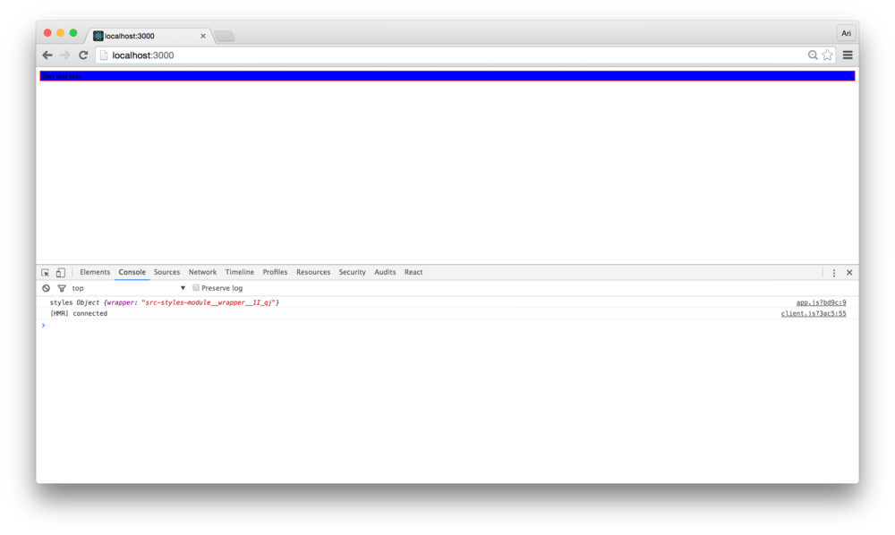
To confirm our css module loading works as expected, let’s create a
styles.module.css in our src/ directory with a
single .wrapper css class (for now):
// In src/styles.module.css
.wrapper {
  background: blue;
}
Loading our css module file in our src/app.js and
applying the .wrapper class to our
<div /> component is straightforward with the
className prop:
// ...
import './app.css'
import styles from './styles.module.css'

const App = React.createClass({
  render: function() {
    return (
      <div className={styles.wrapper}>
        Text text text
      </div>
    )
  }
});
// ...
Loading our server using npm start and refreshing our
Chrome window, we see that our css module style is set from the
styles.wrapper class created by the css module.
In our app, we’re going to interface with the Google API. As it’s never a good idea to hardcode our keys in a deployed application, we’ll need a way to configure our app to include dynamic API keys based upon the environment.
One effective method for key handling is by using the environment
variables of the system we’re building against and bundling our key.
Using a combination of the webpack.DefinePlugin() and
dotenv, we can create a multi-environment build process
using our environment variables.
First, let’s install the dotenv package:
npm i -D dotenv && touch .envIn our .env file we created at the root of the project,
we can set environment variables that we can build into the project. The
dotenv project allows
us to load configuration scripts and gives us access to these
variables.
Loading the variables is a pretty simple process using
dotenv. In our webpack.config.js file, let’s
load up the .env file in our environment:
// ...
const dotenv = require('dotenv');
const dotEnvVars = dotenv.config();
Our .env file is generally a good spot to place
global environment variables. To separate our environments,
we’ll create a mechanism to load those environment variables as well.
Generally, we’ll keep these in a config/ directory as
[env].config.js.
To load these files in our server, we can use the same function,
except adding a few options to change the source of the file. In our
webpack.config.js file, let’s add loading the second
environment variables:
// ...
const NODE_ENV = process.env.NODE_ENV;
const dotenv = require('dotenv');

// ...

const dotEnvVars = dotenv.config();
const environmentEnv = dotenv.config({
  path: join(root, 'config', `${NODE_ENV}.config.js`),
  silent: true,
});
We can merge these two objects together to allow the
environment-based [env].config.js file to overwrite the
global one using Object.assign():
// ...
const dotEnvVars = dotenv.config();
const environmentEnv = dotenv.config({
  path: join(root, 'config', `${NODE_ENV}.config.js`),
  silent: true,
});
const envVariables =
    Object.assign({}, dotEnvVars, environmentEnv);
Our envVariables variable now contains all the
environment variables and globally defined environment variables. In
order to reference them in our app, we’ll need to grant access to this
envVariables variable.
Webpack ships with a few common plugins including the
DefinePlugin(). The DefinePlugin() implements
a regex that searches through our source and replaces variables defined
in a key-value object, where the keys are the names of variables and
their value is replaced in the source before shipping to the
browser.
It’s conventional to surround the replaced variable by two
underscores (__) on either side of the variable. For
instance, access to the NODE_ENV variable in our source
would be referenced by __NODE_ENV__.
We can programmatically walk through our envVariables
and replace each key in the conventional manner and stringifying their
values.
We’ll want to stringify the values we’ll replace using the
DefinePlugin()as they might contain characters that a browser’s JavaScript parser won’t recognize. Stringifying these values helps avoid this problem entirely.
In our webpack.config.js file, let’s use the
reduce() method to create an object that contains
conventional values in our source with their stringified values:
// ...
const envVariables =
    Object.assign({}, dotEnvVars, environmentEnv);

const defines =
  Object.keys(envVariables)
  .reduce((memo, key) => {
    const val = JSON.stringify(envVariables[key]);
    memo[`__${key.toUpperCase()}__`] = val;
    return memo;
  }, {
    __NODE_ENV__: JSON.stringify(NODE_ENV)
  });
The defines object can now become the configuration
object that the DefinePlugin() plugin expects to use to
replace variables. We’ll prepend the existing webpack plugin list with
our DefinePlugin():
// ...
const defines =
// ...
config.plugins = [
new webpack.DefinePlugin(defines)
].concat(config.plugins);
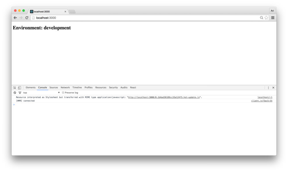
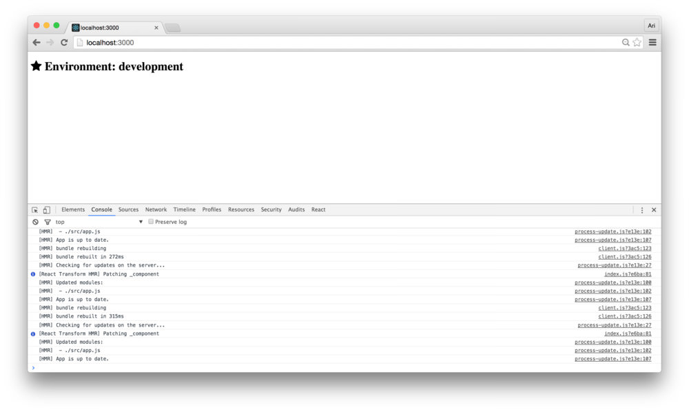
// ...Checking to see if the replacement is working as we expect, we can
set our <App /> component to display these variables
(as JavaScript strings). For instance, to see the environment using the
__NODE_ENV__ value, we can modify the render()
function:
//...
const App = React.createClass({
  render: function() {
    return (
      <div className={styles.wrapper}>
        <h1>Environment: {__NODE_ENV__}</h1>
      </div>
    )
  }
});
// ...
Kicking up our server using npm start and refreshing our
browser, we’ll see that the value has been replaced by the string
development (as set by NODE_ENV=development in
our start script).
In our app, we’ll use Font Awesome to display rating stars. We’ve
already handled most of the work required to get font awesome working.
We’ll just need to install the font-awesome dependency and
require the css in our source.
Installing the dependency is straightforward using
npm:
npm i -S font-awesomeTo use the fonts in font-awesome, we just need to apply the proper classes as described in the font awesome docs after we require the css in our source.
Requiring the font-awesome css in our source is pretty easy. Since
we’ll use this across components, we can require it in our main
src/app.js:
import React from 'react'
import ReactDOM from 'react-dom'

import 'font-awesome/css/font-awesome.css'
// ...
Using font-awesome in our react components is like using font-awesome
outside of react, placing the right css classes. To add a star to our
<App /> component from font-awesome, we can modify
our render() function:
// ...

import 'font-awesome/css/font-awesome.css'
// ...

const App = React.createClass({
  render: function() {
    return (
      <div className={styles.wrapper}>
        <h1>
          <i className="fa fa-star"></i>
          Environment: {__NODE_ENV__}</h1>
      </div>
    )
  }
});
Reloading our browser, we can see that the font-awesome css has loaded correctly and is displaying the star icon from the font-awesome icon library:
requiresAs we’re using webpack to package our app, we can use it to make packaging our relative requires simpler. Rather than requiring files relative to the directory that the current file is located in, we can require them using an alias.
Let’s add the webpack root to be both the
node_modules/ directory as well as the src/
directory. We can also set up a few aliases referencing the directories
we previously created:
var config = getConfig({
  // ...
})
// ...
config.resolve.root = [src, modules]
config.resolve.alias = {
  'css': join(src, 'styles'),
  'containers': join(src, 'containers'),
  'components': join(src, 'components'),
  'utils': join(src, 'utils')
}
In our source, instead of referencing our containers by
relative path, we can simply call
require('containers/SOME/APP').
React offers a wide range of methods of testing that our application is working as we expect it to work. We’ve been opening the browser and refreshing the page (although, hot-reloading is set up, so even refreshing the page isn’t a requirement).
Although developing with such rapid feedback is great and offers convenience at development time, writing tests to programmatically test our application is the quickest, most reliable way to ensure our app works as we expect it to work.
Most of the code we will write in this section will be test-driven, meaning we’ll implement the test first and then fill out the functionality of our components. Let’s make sure that we can test our code.
Although the react team uses jest (and we cover it in-depth in fullstackreact), we’ll be using a combination of tools:
Let’s start by installing our testing dependencies. We’ll install the usual suspects, plus a babel polyfill so we can write our tests using ES6.
npm i -D mocha chai enzyme chai-enzyme expect sinon babel-register babel-polyfill react-addons-test-utilsWe’ll be using a library called enzyme to make testing our react
components a bit easier and for fun to write. In order to set it up
properly, however, we will need to make a modification to our webpack
setup. We’ll need to install the json-loader to load json
files along with our javascript files (hjs-webpack automatically
configures the json loader for us, so we won’t need to handle updating
the webpack configuration manually):
npm i -D json-loaderWe’ll be using karma to run our tests, so we’ll need to install our karma dependencies. We’ll use karma as it’s a good compliment to webpack, but it does require a bit of setup.
Karma has a fast testing iteration, it includes webpack compiling, runs our tests through babel, and mounts our testing environment in a browser just the same as though we are testing it in our own browser. Additionally, it is well supported and has a growing community working with karma. It makes it a good candidate for us to use together with our webpack build pipeline.
Let’s install the dependencies for karma:
npm i -D karma karma-chai karma-mocha karma-webpack karma-phantomjs-launcher phantomjs-prebuilt phantomjs-polyfill
npm i -D karma-sourcemap-loader
We’ll be using PhantomJS to test our files so we don’t actually need to launch a browser with a window. PhantomJS is a headless, WebKit-driven, scriptable browser with a JS API and allows us to run our tests in the background.
If you prefer to use Google Chrome to run the tests with a window, swap out
karma-phantomjs-launcherwithkarma-chrome-launcherand don’t update the config below.
Grab a cup of tea to let these install (phantom can take a little while to install). Once they are ready, we’ll need to create two config files to both configure karma as well as the tests we’ll have karma launch.
Let’s set up our webpack testing environment through karma. The
easiest way to get started with karma is by using the
karma init command. First, let’s install the karma cli and
a few karma dependencies.
npm install -g karma-cli
npm i -D karma karma-chai karma-mocha karma-webpack karma-phantomjs-launcher phantomjs-prebuilt phantomjs-polyfill
And now we can run karma init to initialize the karma
config file:
karma initAfter we answer a few questions, it will spit out a
karma.conf.js file. Since we’re going to manipulate most of
this file, it’s a good idea to just press enter on all of the questions
to have it generate the file for us.
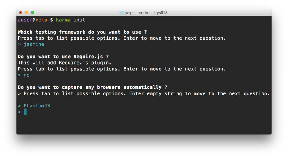
Alternatively, we can
touchthe file as we have done with other files and recreate the file:touch karma.conf.js
With our karma.conf.js file generated, we’ll need to
give it a few configuration options, most of which are autogenerated or
we have already set up.
First, the basics. We’ll use some default options that karma has spit out for us automatically:
module.exports = function(config) {
  config.set({
    // ...
    basePath: '',
    preprocessors: {},
    port: 9876,
    colors: true,
    logLevel: config.LOG_INFO,
    browsers: ['Chrome'],
    concurrency: Infinity,
    plugins: []
  });
}
We’ll need to tell karma that we want to use mocha and chai as the
testing framework, instead of the default jasmine framework, so let’s
change the frameworks: [] option. We’ll also need to add
these to the plugins karma will use.
module.exports = function(config) {
  config.set({
    frameworks: ['mocha', 'chai'],
    basePath: '',
    plugins: [
      'karma-mocha',
      'karma-chai'
    ],
    // ...
  });
}
As we’re using webpack to compile our files together, we’ll also need to tell karma about our webpack configuration. Since we already have one, there is no need to recreate it, we’ll just require our original one.
var webpackConfig = require('./webpack.config');

module.exports = function(config) {
  config.set({
    frameworks: ['mocha', 'chai'],
     webpack: webpackConfig,
     webpackServer: {
       noInfo: true
     },
    // ...
  });
}
We’ll also need to tell karma how to use webpack in it’s
confgiuration. We can do this by setting the karma-webpack
plugin in it’s plugin list.
module.exports = function(config) {
  config.set({
    frameworks: ['mocha', 'chai'],
    webpack: webpackConfig,
    webpackServer: {
      noInfo: true
    },
    plugins: [
      'karma-mocha',
      'karma-chai',
      'karma-webpack'
    ],
    // ...
  });
}
Let’s change the reporter to something a tad nicer (the
spec-reporter, instead of the default
progress) reporter and change the browser from
Chrome to PhantomJS (adding the proper
plugins).
First, let’s install the spec reporter:
npm i -D karma-spec-reporterBack in our karma.conf.js file, let’s add the plugins
and change the browsers and plugins:
module.exports = function(config) {
  config.set({
    reporters: ['spec'],
    plugins: [
      'karma-mocha',
      'karma-chai',
      'karma-webpack',
      'karma-phantomjs-launcher',
      'karma-spec-reporter'
    ],
    browsers: ['PhantomJS']
    // ...
  });
}
Finally, we need to tell karma where to find the files it will run as our tests. Instead of pointing it to the actual tests, we’ll use a middleman, a webpack config to tell Karma where to find the tests and package them together.
module.exports = function(config) {
  config.set({
    files: [
      'tests.webpack.js'
    ],
    // ...
  })
}
Before we move on, we’ll need to let karma know that it needs to run
our tests.webpack.js file through the webpack preprocessor.
We’ll also ask it to run it through a sourcemap preprocessor to spit out
usable sourcemaps (so we can debug our code effectively):
module.exports = function(config) {
  config.set({
    files: [
      'tests.webpack.js'
    ],
    preprocessors: {
      'tests.webpack.js': ['webpack', 'sourcemap']
    },
    plugins: [
      'karma-mocha',
      'karma-chai',
      'karma-webpack',
      'karma-phantomjs-launcher',
      'karma-spec-reporter',
      'karma-sourcemap-loader'
    ],
    // ...
  });
}
Let’s create the tests.webpack.js file. This file will
serve as middleware between karma and webpack. Karma will use this file
to load all of the spec files, compiled through webpack.
The file is fairly simple:
require('babel-polyfill');
var context = require.context('./src', true, /\.spec\.js$/);
context.keys().forEach(context);
When karma executes this file, it will look through our
src/ directory for any files ending in
.spec.js and execute them as tests. Here, we can set up any
helpers or global configuration we’ll use in all of our tests.
Since we’re going to be using a helper called
chai enzyme, we can set our global configuration up
here:
require('babel-polyfill');
// some setup first

var chai = require('chai');
var chaiEnzyme = require('chai-enzyme');

chai.use(chaiEnzyme())

var context = require.context('./src', true, /\.spec\.js$/);
context.keys().forEach(context);
Up through this point, our complete karma conf file should look like this:
var path = require('path');
var webpackConfig = require('./webpack.config');

module.exports = function(config) {
  config.set({
    basePath: '',
    frameworks: ['mocha', 'chai'],
    files: [
      'tests.webpack.js'
    ],

    preprocessors: {
      // add webpack as preprocessor
      'tests.webpack.js': ['webpack', 'sourcemap'],
    },

    webpack: webpackConfig,
    webpackServer: {
      noInfo: true
    },

    plugins: [
      'karma-mocha',
      'karma-chai',
      'karma-webpack',
      'karma-phantomjs-launcher',
      'karma-spec-reporter',
      'karma-sourcemap-loader'
    ],

    reporters: ['spec'],
    port: 9876,
    colors: true,
    logLevel: config.LOG_INFO,
    browsers: ['PhantomJS']
  })
};
We’ve covered almost the entire karma setup, but we’re missing two final pieces. Before we complete the karma setup, let’s create a sample test file so we can verify our test setup is complete.
Instead of placing a sample file in the root (only to move it later),
let’s place it in it’s final spot. We’re going to use the
<App /> component we created earlier as a container
for the rest of our app. We’ll create a spec file in the
containers/App/App.spec.js file.
mkdir src/containers/App && touch src/containers/App/App.spec.jsIn here, let’s create a simple test that tests for the existence of an element with a custom wrapper style class (from our CSS modules).
Without going in-depth to writing tests (yet), this simple test describes our intention using mocha and chai.
import React from 'react'
import { expect } from 'chai'
import { shallow } from 'enzyme'

import App from './App'
import styles from './styles.module.css'

describe('<App />', function () {
  let wrapper;
  beforeEach(() => {
    wrapper = shallow(<App />)
  })

  it('has a single wrapper element', () => {
    expect(wrapper.find(`.${styles.wrapper}`))
            .to.have.length(1);
  });
});
We walk through testing our app later in this course. For the time being, feel free to copy and paste the code into your own file to get us through setting up our build/test workflow.
To get this test running, we’ll need to create two more files from
the previous test. The src/containers/App.js file along
with the custom CSS module
src/containers/styles.module.css. We don’t need to make our
tests pass, initially, just get them running.
Let’s create the App.js file and move our original
src/styles.module.css into the container directory:
touch src/containers/App/App.js
mv src/styles.module.css \
     src/containers/App/styles.module.css
Let’s go ahead and move our <App /> definition
from src/app.js into this new file at
src/containers/App/App.js:
import React from 'react'
import ReactDOM from 'react-dom'

import styles from './styles.module.css'

const App = React.createClass({
  render: function() {
    return (
      <div className={styles.wrapper}>
        <h1>
          <i className="fa fa-star"></i>
          Environment: {__NODE_ENV__}</h1>
      </div>
    )
  }
});

module.exports = App;
Finally, we’ll need to import the <App />
component from the right file in our src/app.js:
// ...
import './app.css'

import App from 'containers/App/App'

const mountNode = document.querySelector('#root');
ReactDOM.render(<App />, mountNode);
To execute our tests, we’ll use the karma command
installed in our ./node_modules directory by our previous
npm install:
NODE_ENV=test \
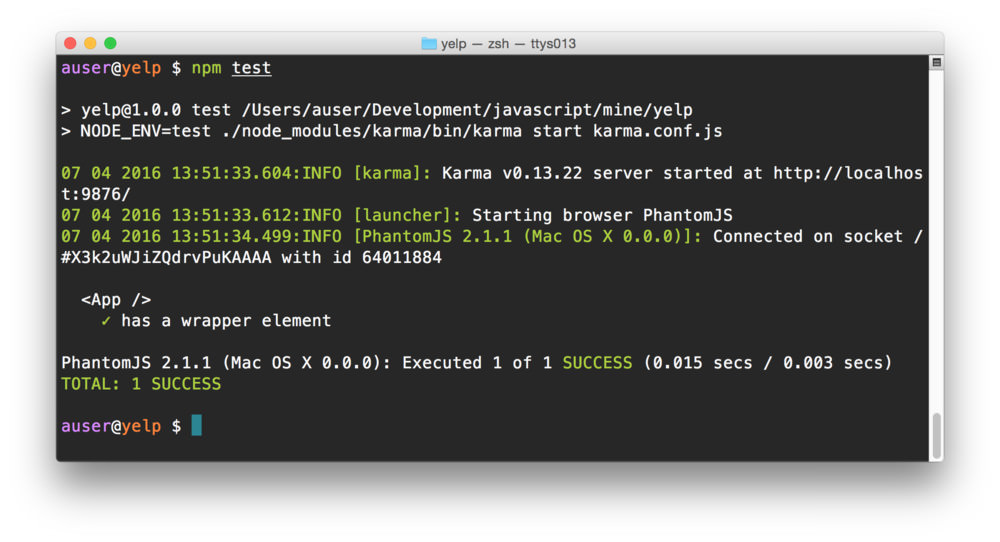
./node_modules/karma/bin/karma start karma.conf.js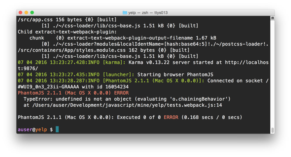
Uh oh! We got an error. Do not worry, we expected this… don’t look behind the curtain…
This error is telling us two things. The first is that webpack is trying to find our testing framework and bundle it in with our tests. Webpack’s approach to bundling is using a static file analyzer to find all the dependencies we’re using in our app and to try to bundle those along with our source. As enzyme imports some dynamic files, this approach doesn’t work.
Obviously we don’t want to do this as we don’t need to bundle tests
with our production framework. We can tell webpack to ignore our testing
framework and assume that it’s available for us by setting it as an
external dependency.
In our webpack.config.js file, let’s set a few external
dependencies that enzyme expects:
// ./webpack.config.js
// ...
var config = getConfig({
  isDev,
  in: join(src, 'app.js'),
  out: dest,
  clearBeforeBuild: true
});

config.externals = {
  'react/lib/ReactContext': true,
  'react/lib/ExecutionEnvironment': true,
  'react/addons': true
}
// ...
The second error we’ve encountered is that our testing framework is that a few of our production webpack plugins are mucking with our tests. We’ll need to exclude a few plugins when we’re running webpack under a testing environment. Since we’re now handling two cases where testing with webpack differs from production or development, let’s create a conditional application for our webpack testing environment.
First, we can tell if we are in a testing environment by checking to
see if the command we are issuing is karma OR by checking
the NODE_ENV is test. At the top of our
webpack.config.js file, let’s set our variable
isTest:
require('babel-register');

const NODE_ENV = process.env.NODE_ENV;
const isDev  = NODE_ENV === 'development';
const isTest = NODE_ENV === 'test';
// ...
Later in our config file, we can manipulate our config under testing environments vs. dev/production environments.
Moving our previous externals definition into this
conditional statement and excluding our production plugins, our updated
webpack.config.js file:
// ./webpack.config.js
// ...
var config = getConfig({
// ...
});

if (isTest) {
  config.externals = {
    'react/lib/ReactContext': true,
    'react/lib/ExecutionEnvironment': true
  }

  config.plugins = config.plugins.filter(p => {
    const name = p.constructor.toString();
    const fnName = name.match(/^function (.*)\((.*\))/)

    const idx = [
      'DedupePlugin',
      'UglifyJsPlugin'
    ].indexOf(fnName[1]);
    return idx < 0;
  })
}
// ...
Now, if we run our tests again, using karma we’ll see that our tests are running, they are just not passing yet.
NODE_ENV=test \
   ./node_modules/karma/bin/karma start karma.conf.js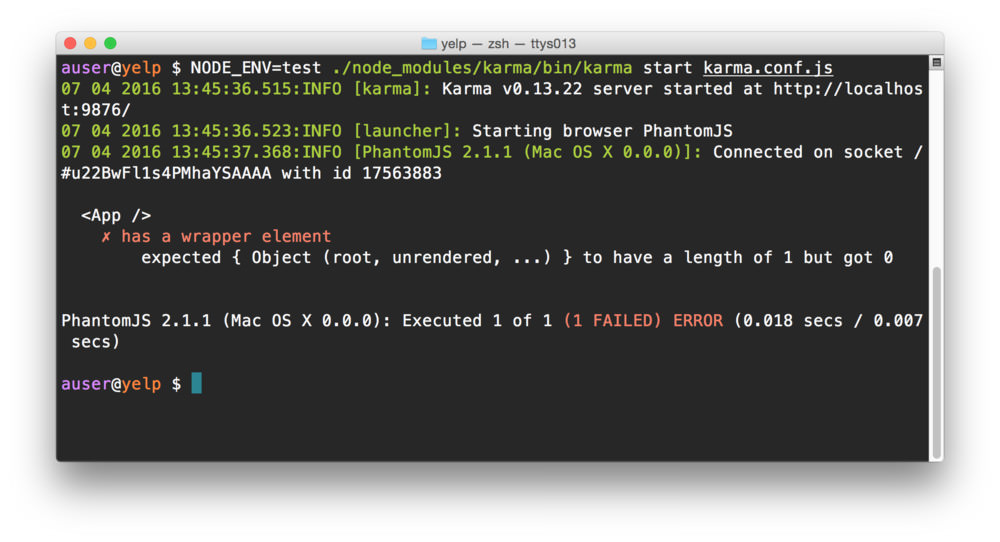
Let’s get our test passing!
First, let’s wrap our long karma command into an npm script instead
of running it at the command-line. In our package.json
file, let’s update the test script with our karma
command.
{
  "name": "yelp",
  "version": "1.0.0",
  "description": "",
  "scripts": {
    "start": "./node_modules/.bin/hjs-dev-server",
    "test": "NODE_ENV=test ./node_modules/karma/bin/karma start karma.conf.js"
  },
  // ...
}
Instead of passing the previous command, we can run our tests with
npm test:
npm testOur previous test is not passing because although we have defined a
.wrapper{} class in our
src/containers/App/styles.module.css file, it’s empty so
webpack just discards the class and styles.wrapper ends up
undefined. In order to get our test passing, we’ll need to add a
description to it.
.wrapper {
  display: flex;
}
Let’s also delete the contents of src/styles.module.css
to get rid of the blue background.
We’ll be using the flexbox
layout in our app, so we can use display: flex; in our css
description.
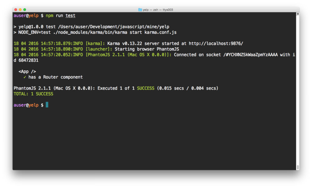
Running our tests again, using npm test this time, we
can see that our test goes all green (i.e. passes).
It can be a tad painful when flipping back and forth between our terminal and code windows. It would be nice to have our tests constantly running and reporting any failures instead. Luckily karma handles this easily and so can we.
We’ll use a command-line parser to add an npm script to tell karma to
watch for any file changes. In our package.json file, let’s
add the test:watch command:
{
  "name": "yelp",
  "version": "1.0.0",
  "description": "",
  "scripts": {
    "start": "./node_modules/.bin/hjs-dev-server",
    "test": "NODE_ENV=test ./node_modules/karma/bin/karma start karma.conf.js",
    "test:watch": "npm run test -- --watch"
  },
  // ...
}
Instead of using npm test, we’ll launch our test watcher
by using npm run test:watch. We’ll also need to tell karma
(by using our karma.conf.js config file) that we want it to
watch for any changes to our files.
Karma handles this out of the box for us by using the
singleRun key in it’s configuration object. We can set this
using a command-line parser called yargs. Let’s install
yargs as a development dependency:
npm i -D yargsIn our karma.conf.js file, we can check for the
--watch flag using yargs and set the singleRun
option based upon the existence of the --watch flag.
var argv = require('yargs').argv;
// ...
module.exports = function(config) {
  config.set({
    basePath: '',
    frameworks: ['mocha', 'chai'],
    // ...
    singleRun: !argv.watch
  });
}
Now, when we execute the npm run test:watch script and
modify and save a file, our tests will be executed, making for easy,
fast test-driven development.
Let’s build the “infrastructure” of our app first. Our
<App /> container element will contain the structure
of the page, which essentially boils down to handling routes.
Being good software developers, let’s build our test first to verify
that we are able to ensure our assumptions about the component. Let’s
make sure that we have a <Router /> component loaded
in our app.
This is also a good time for us to spend setting up our app testing structure.
In src/containers/App/App.spec.js, let’s build the
beginning of our jasmine spec. First, we’ll need to include our
libraries and the App component itself:
import { expect } from 'chai'
import { shallow } from 'enzyme'

import App from './App'

describe('<App />', () => {
  // define our tests in here
})
We’ll use expect() to set up our expectations and
shallow() (from enzyme) to render our elements into the
test browser.
When testing any code in any language, the principles of testing are pretty much the same. We want to:
In Jasmine, each of these steps are well-defined:
describe()/it() defines the
functionalityexpect() to set the expectationbeforeEach() and matchers to confirm the
outputTo set up our our test, we’ll need to pretend we’re
rendering our <App /> component in the
browser. Enzyme makes this easy regardless of handling shallow or deep
rendering (we’ll look at the difference later).
In our test, we can shallow render our
<App /> component into our browser and store the
result (which will be our rendered DOM component). Since we’ll want a
“clean” version of our component every time, we need to do this in the
beforeEach() block of our test:
// ...
describe('<App />', () => {
  // define our tests in here
  let wrapper; // "dom" node wrapper element
  beforeEach(() => {
    wrapper = shallow(<App />);
  })
})
With our test set up, we can test that our <App />
component contains a Router component by using the
find() method in our wrapper instance. To set the
expectation in our component, we’ll use expect():
// ...
describe('<App />', () => {
  // ...

  it('has a Router component', () => {
    expect(wrapper.find('Router'))
        .to.have.length(1);
  })
})
Finally, we can run our tests by using our npm script we
previously built:
npm run test
Since we haven’t implemented the <App />
component, our test will fail. Let’s turn our test green.
Before we implement our routes, let’s take a quick look at how we’ll set up our routing.
When we mount our react app on the page, we can control where the
routes appear by using the children to situate routes where
we want them to appear. In our app, we’ll have a main header bar that
we’ll want to exist on every page. Underneath this main header, we’ll
switch out the content for each individual route.
We’ll place a <Router /> component in our app as a
child of the component with rules which designate which
children should be placed on the page at any given route. Thus, our
<App /> component we’ve been working with will simply
become a container for route handling, rather than an element to
hold/display content.
Although this approach sounds complex, it’s an efficient method for holding/generating routes on a per-route basis. It also allows us to create custom data handlers/component generators which come in handy for dealing with data layers, such as Redux.
With that being said, let’s move on to setting up our main views.
In our src/containers/App/App.js, let’s make sure we
import the react-router library.
import React, { PropTypes } from 'react';
import { Router } from 'react-router';

// ...
Next, in our usual style, let’s build our React component (either
using the createClass({}) method we used previously
or using the class-based style, as we’ll switch to here):
import React, { PropTypes } from 'react';
import { Router } from 'react-router';

class App extends React.Component {
  render() {
    return (<div>Content</div>)
  }
}
We like to include our content using the classical getter/setter method, but this is only a personal preference.
import React, { PropTypes } from 'react'
import { Router } from 'react-router'

class App extends React.Component {
  // class getter
  content() {
    return (<Router />)
  }

  render() {
    return (
      <div style={ { height: '100%' } }>
        {this.content}
      </div>
    )
  }
}
We’ll use our app container to return an instance of the
<Router /> component. The
<Router /> component require us to pass a history
object which tells the browser how to listen for the location object on
a document. The history tells our react component how to route.
There are multiple different types of history objects we can use, but
the two most popular types are the browserHistory and
hashHistory types. The browserHistory object
uses the native html5 react router to give us routes that appear to be
server-based.
On the other hand, the hashHistory uses the
# sign to manage navigation. Hash-based history, an old
trick for client-side routing is supported in all browsers.
We’ll use the browserHistory method here. We need to
tell the <Router /> instance we want to use the
browserHistory by passing it as a prop in our routing
instance:
import React, { PropTypes } from 'react';
import { Router } from 'react-router';

class App extends React.Component {
  static propTypes = {
    history: PropTypes.object.isRequired
  }

  // class getter
  get content() {
    return (
      <Router history={this.props.history} />
    )
  }

  render() {
    return (
      <div style={ { height: '100%' } }>
        {this.content}
      </div>
    )
  }
}
We’re almost ready to place our routes on the page, we just have to
pass in our custom routes (we’ll make them shortly). We’ll wrap our
routes into this <App /> component:
import React, { PropTypes } from 'react';
import { Router } from 'react-router';

class App extends React.Component {
  static propTypes = {
    routes: PropTypes.object.isRequired,
    history: PropTypes.object.isRequired
  }

  // class getter
  get content() {
    return (<Router
        routes={this.props.routes}
        history={this.props.history} />)
  }

  render() {
    return (
      <div style={ { height: '100%' } }>
        {this.content}
      </div>
    )
  }
}
In order to actually use our <App /> component,
we’ll need to pass through the two props the component itself expects to
receive when we render the <App /> component:
browserHistory object from
react router and pass this export directly.Back in our src/app.js file, we’ll pass through the
history directly as we import it.
import React from 'react'
import ReactDOM from 'react-dom'

import 'font-awesome/css/font-awesome.css'
import './app.css'

import {browserHistory} from 'react-router'

import App from 'containers/App/App'

const mountNode = document.querySelector('#root');
ReactDOM.render(
  <App history={browserHistory} />, mountNode);
Lastly, we’ll need to build some routes. For the time being, let’s get some data in our browser. Let’s show a single route just to get a route showing up. We’ll revise this shortly.
To build our routes, we need access to the:
<Router /> component<Route /> componentThe Router and Route component can be
imported directly from react-router:
import React from 'react'
import ReactDOM from 'react-dom'

import 'font-awesome/css/font-awesome.css'
import './app.css'

import {browserHistory, Router, Route} from 'react-router'

import App from 'containers/App/App'

const mountNode = document.querySelector('#root');
ReactDOM.render(
  <App history={browserHistory} />, mountNode);
We can create our custom route by building a JSX instance of the routes using these two components:
// ...
import './app.css'

import {browserHistory, Router, Route} from 'react-router'

const routes = (
  <Router>
    <Route path="/" component={Home} />
  </Router>
)
//...
Since we haven’t yet defined the Home component above,
the previous example fails, so we can create a really simple to prove it
is working:
// ...
import './app.css'
import {browserHistory, Router, Route} from 'react-router'
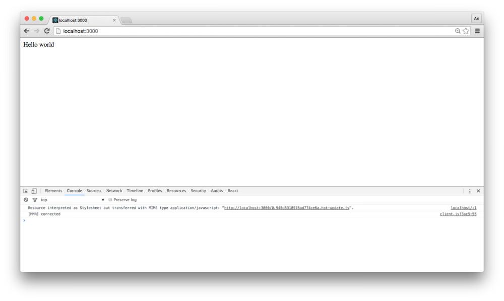
const Home = React.createClass({
render: function() {
return (<div>Hello world</div>)
}
})
const routes = (
<Router>
<Route path="/" component={Home} />
</Router>
)
//...Finally, we can pass the routes object into our instance
of <App /> and refreshing our browser. Provided we
haven’t made any major typos, we’ll see that our route has resolved to
the root route and “Hello world” is rendered to the DOM.
We also see that our tests pass as the <App />
component now has a single <Router /> component being
rendered as a child.
Up through this point, we’ve built our app using a demo routing
scheme with a single route that doesn’t do very much. Let’s break out
our routes to their own file both to keep our src/app.js
clean and to separate concerns from the bootstrap script.
Let’s create a src/routes.js file where we’ll export our
routes and we can consume them from the src/app.js
file.
touch src/routes.jsIn this src/routes.js file, let’s create and export a
function to create and export the routes JSX instance rather. Let’s copy
and remove the instances from the src/app.js file and into
our new routes.js file. Moving the contents from
src/routes.js should leave the routes file as:
import React from 'react'
import {browserHistory, Router, Route, Redirect} from 'react-router'

const Home = React.createClass({
  render: function() {
    return (<div>Hello world</div>)
  }
})

export const makeRoutes = () => (
    <Router>
      <Route path="/" component={Home} />
      <Redirect from="*" to="/" />
    </Router>
  )

export default makeRoutes
To use this in our src/app.js file, we can replace our
routes definition and call the exported function
makeRoutes:
import React from 'react'
import ReactDOM from 'react-dom'

import 'font-awesome/css/font-awesome.css'
import './app.css'

import App from 'containers/App/App'

import {browserHistory} from 'react-router'
import makeRoutes from './routes'

const routes = makeRoutes()

const mountNode = document.querySelector('#root');
ReactDOM.render(
  <App history={browserHistory}
        routes={routes} />, mountNode);
Let’s confirm our <App /> is still running as we
expect by using npm run test. If we don’t make any typos,
our app should still render in the browser.
With our routing set up, let’s move on to building our main view. This main view is designed to display our main map and the listing of restaurants. This is our main map page.
Since we’ll be building a complex application, we like to separate our routes by themselves to be controlled by the component that will be using them. In other words, we’ll be building our main view with the idea that it will define it’s sub-routes as opposed to having one gigantic routing file, our nested components can define their own views.
Let’s make a new directory in our root src directory we’ll call views
with a single directory in it with the name of the route we’ll be
building. For lack of a better name: Main/:
mkdir -p src/views/MainIn this Main/ directory, let’s create two files:
Main/ view to define it’s
own routingtouch src/views/Main/{Container,routes}.js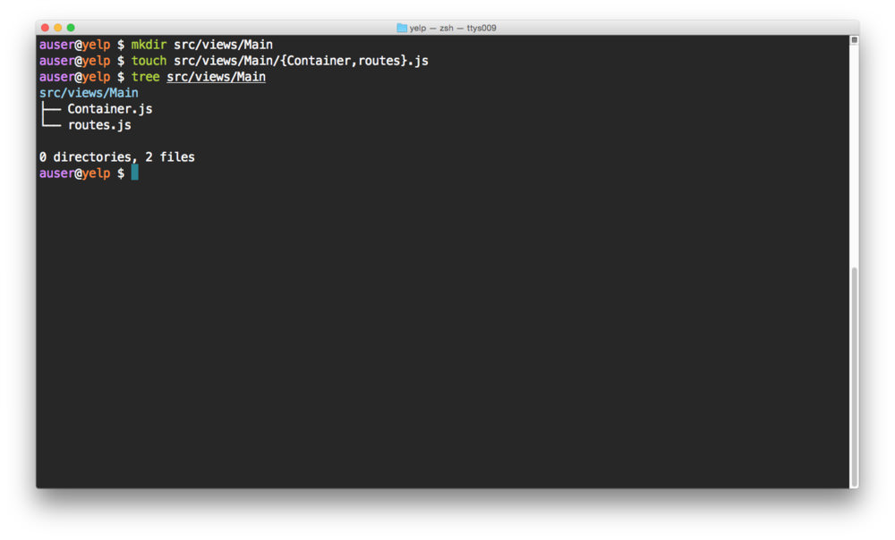
To get things started, let’s add a single route for the Container in
our src/views/Main/routes.js file. The
routes.js file can simply contain a route definition object
just as though it is a top level routes file.
import React from 'react'
import {Route} from 'react-router'
import Container from './Container'

export const makeMainRoutes = () => {

  return (
    <Route path="/" component={Container} />
  )
}

export default makeMainRoutes;
When we import this routes file into our main routes
file, we’ll define some children elements, but for the time being, to
confirm the set-up is working as we expect it, we’ll work with a simple
route container element. The container element can be as simple as the
following:
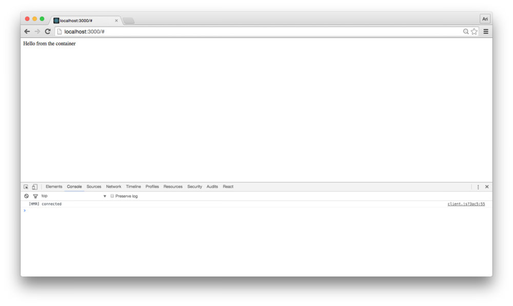
// in src/views/Main/Container.js
import React from 'react'

export class Container extends React.Component {
  render() {
    return (
      <div>
        Hello from the container
      </div>
    )
  }
}

export default Container
With our containing element defined, let’s flip back to our
src/routes.js file to include our new sub-routes file.
Since we exported a function, not an object, we’ll need to make sure we
display the return value of the function rather than the function
itself.
Modifying our initial src/routes.js file, to both remove
the Home container definition and import our new routes,
our src/routes.js file can look more akin to the
following:
import React from 'react'
import {browserHistory, Router, Route, Redirect} from 'react-router'

import makeMainRoutes from './views/Main/routes'

export const makeRoutes = () => {
  const main = makeMainRoutes();

  return (
    <Route path=''>
      {main}
    </Route>
  )
}

export default makeRoutes
Since we’re defining sub-routes in our application, we won’t need to
touch the main routes.js file much for the rest of this
application. We can follow the same steps to add a new top-level
route.
Refreshing the browser, we’ll see our new content comes directly from the new container element.
Before we jump too far ahead, let’s get our
<Map /> component on the page. In a previous article,
we built a <Map /> component from the ground-up, so
we’ll be using this npm module to generate our map. Check out this
in-depth article at ReactMap.
Let’s install this npm module called
google-maps-react:
npm install --save google-maps-reactIn our <Container /> component, we’ll place an
invisible map on the page. The idea behind an invisible map
component is that our google map will load the Google APIs, create a
Google Map instance and will pass in on to our children components, but
won’t be shown in the view. This is good for cases where we want to use
the Google API, but not necessarily need to show a map at the same time.
Since we’ll be making a list of places using the Google Places API,
we’ll place an invisible <Map /> component on
screen.
Before we can use the <Map /> component, we’ll
need to grab a google API key. In our webpack set up, we’re using the
WebpackDefinePlugin() to handle replacing variables in our
source, so we can set our google key as a variable in our
.env file and it will just work.
For information on how to get a Google API key, check out the ReactMap article.
In our /.env file, let’s set the GAPI_KEY
to our key:
GAPI_KEY=abc123To use our GAPI_KEY, we’ll reference it in our code
surrounded by underscores (i.e.: __GAPI_KEY__).
Before we can start using the <Map /> component,
we’ll need to wrap our <Container /> component in the
GoogleApiWrapper() higher-order component. This HOC gives
us access to the lazily-loaded google api and pass through a
google prop which references the object loaded by the
google script.
import React from 'react'
import Map, {GoogleApiWrapper} from 'google-maps-react'

export class Container extends React.Component {
  // ...
}

export default GoogleApiWrapper({
  apiKey: __GAPI_KEY__
})(Container)
Now, when we load the <Container /> component on
the page, the wrapper takes care of loading the google api along with
our apiKey.
With the google API loaded, we can place a <Map />
component in our <Container /> component and it will
just work. Let’s make sure by placing a
<Map /> instance in our component:
The only requirement the <Map /> component needs
is the google prop, so we can add the
<Map /> component directly in our render code:
import React from 'react'
import Map, {GoogleApiWrapper} from 'google-maps-react'

export class Container extends React.Component {
  render() {
    return (
      <div>
        Hello from the container
        <Map
          google={this.props.google} />
      </div>
    )
  }
}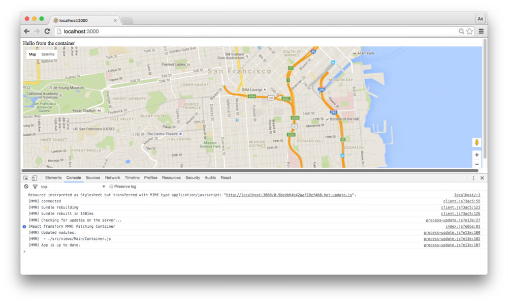
With the google map displaying on our page, we can load up and start using the google maps service.
With the hard work out of the way (displaying the map),
let’s get to displaying a list of places using the google api. When the
<Map /> loads in the browser, it will call the prop
function onReady() if it’s passed in. We’ll use the
onReady() function to trigger a call to the google places
API using the google script.
Let’s modify our src/views/Main/Container.js file to
define an onReady() function we can pass as a prop:
export class Container extends React.Component {
  onReady(mapProps, map) {
    // When the map is ready and mounted
  }
  render() {
    return (
      <div>
        <Map
          onReady={this.onReady.bind(this)}
          google={this.props.google} />
      </div>
    )
  }
}
From here, we can use the google API as though we aren’t using
anything special. We’ll create a helper function to run the google api
command. Let’s create a new file in our src/utils directory
called googleApiHelpers.js. We can nest all our Google API
functions in here to keep them in a common place. We can return a
promise from our function so we can use it regardless of the
location:
export function searchNearby(google, map, request) {
  return new Promise((resolve, reject) => {
    const service = new google.maps.places.PlacesService(map);

    service.nearbySearch(request, (results, status, pagination) => {
      if (status == google.maps.places.PlacesServiceStatus.OK) {

        resolve(results, pagination);
      } else {
        reject(results, status);
      }
    })
  });
}
Now, within our container we can call this helper along with the maps
and store the return from the google request within the
onReady() prop function for our <Map />
component.
import {searchNearby} from 'utils/googleApiHelpers'

export class Container extends React.Component {
  onReady(mapProps, map) {
    const {google} = this.props;
    const opts = {
      location: map.center,
      radius: '500',
      types: ['cafe']
    }
    searchNearby(google, map, opts)
      .then((results, pagination) => {
        // We got some results and a pagination object
      }).catch((status, result) => {
        // There was an error
      })
  }
  render() {
    return (
      <div>
        <Map
          onReady={this.onReady.bind(this)}
          google={this.props.google} />
      </div>
    )
  }
}
Since we’ll be storing a new state of the
<Container /> so we can save the new results in our
<Container />, let’s set it to be stateful:
export class Container extends React.Component {
  constructor(props) {
    super(props);

    this.state = {
      places: [],
      pagination: null
    }
  }
  // ...
Now, when we fetch successful results, we can instead set some state
on the local <Container /> to hold on to the results
fetched from Google. Updating our onReady() function with
setState:
export class Container extends React.Component {
  onReady(mapProps, map) {
    const {google} = this.props;
    const opts = {
      location: map.center,
      radius: '500',
      types: ['cafe']
    }
    searchNearby(google, map, opts)
      .then((results, pagination) => {
        this.setState({
          places: results,
          pagination
        })
      }).catch((status, result) => {
        // There was an error
      })
  }
  // ...
}
Now, we can update our render() method by listing the
places fetch we now have in our state:
export class Container extends React.Component {
// ...
render() {
return (
<div>
Hello from the container
<Map
google={this.props.google}
onReady={this.onReady.bind(this)}
visible={false}>
{this.state.places.map(place => {
return (<div key={place.id}>{place.name}</div>)
})}
</Map>
</div>
)
}
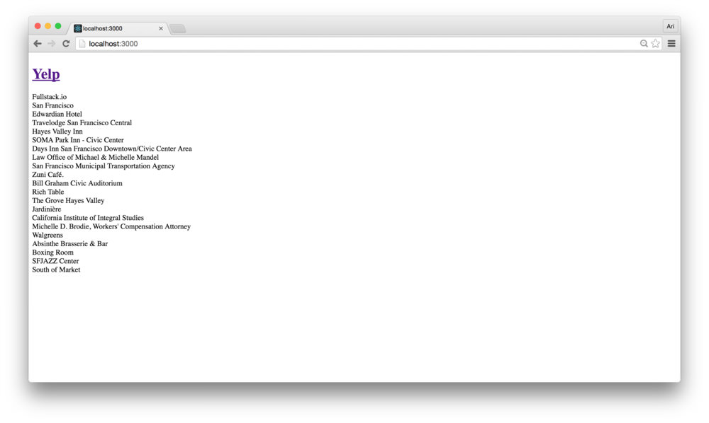
}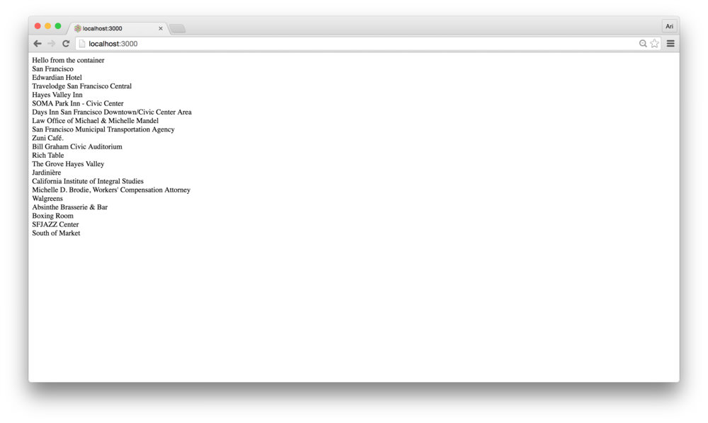 Demo: A List of Places
With our listing of places in-hand, let’s move on to actually turning our app into a closer to yelp-like component. In this section, we’re going to use turn our app into something that looks a little stylish and add some polish.
In order to build this part of the app, we’re going to add some inline styling and use the natural React props flow.
First, let’s install an npm module called classnames. The README.md is a fantastic resource for understanding how it works and how to use it. We’re going to use it to combine classes together (this is an optional library), but useful, regardless.
npm install --save classnamesNow, let’s get to breaking out our app into components. First, let’s
build a <Header /> component to wrap around our
app.
As we’re building a shared component (rather than one specific to one
view), a natural place to build the component would be the the
src/components/Header directory. Let’s create this
directory and create the JS files that contain the component and
tests:
mkdir src/components/Header
touch src/components/Header/{Header.js,Header.spec.js}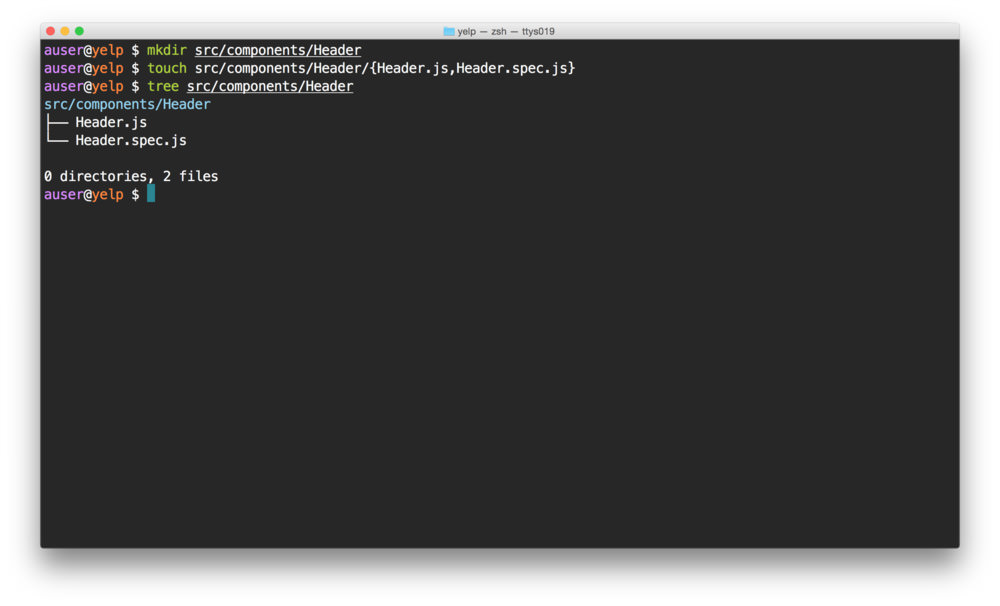
Our <Header /> component can be pretty simple. All
we’ll use it for is to wrap the name of our app and possibly contain a
menu (although we won’t build this here). As we’re building our
test-first app, let’s write the spec that reflects the
<Header /> purpose first:
In the src/components/Header.spec.js file, let’s create
the specs:
import React from 'react'
import { expect } from 'chai'
import { shallow } from 'enzyme'

import Header from './Header'

describe('<Header />', () => {
  let wrapper;
  beforeEach(() => {
    wrapper = shallow(<Header />)
  });

  // These show up as pending tests
  it('contains a title component with yelp');
  it('contains a section menu with the title');
})
The tests themselves are pretty simple. We’ll simply expect for the text we expect:
import React from 'react'
import { expect } from 'chai'
import { shallow } from 'enzyme'
import Header from './Header'
describe('<Header />', () => {
let wrapper;
beforeEach(() => {
wrapper = shallow(<Header />)
});
it('contains a title component with yelp', () => {
expect(wrapper.find('h1').first().text())
.to.equal('Yelp')
});
it('contains a section menu with the title', () => {
expect(wrapper.find('section').first().text())
.to.equal('Fullstack.io')
});
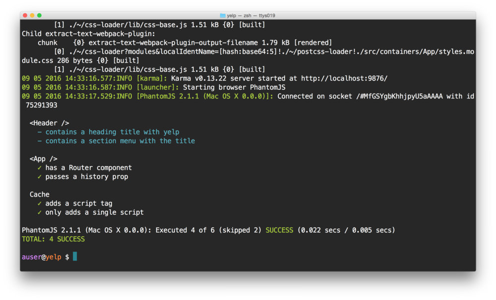
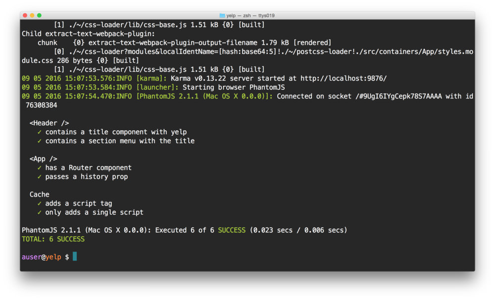
})Running our tests at this point will obviously fail because we haven’t yet written the code to make them pass. Let’s get our tests going green.
Since the full component itself is pretty straightforward, nearly the entire implementation (without styles) can be summed to:
import React from 'react'
import {Link} from 'react-router'

export class Header extends React.Component {
  render() {
    return (
      <div>
        <Link to="/"><h1>Yelp</h1></Link>
        <section>
          Fullstack.io
        </section>
      </div>
    )
  }
}

export default Header
Running the tests will now pass:
But loading the browser, the styles don’t look quite right yet… Let’s
see it in the browser by making sure we import our new component into
our main view and using in the render() function of our
main <Container /> component. In
src/views/Main/Container.js:
// our webpack alias allows us to reference `components`
// relatively to the src/ directory
import Header from 'components/Header/Header'

// ...
export class Container extends React.Component {
  // ...
  render() {
    return (
      <div>
        <Map
          visible={false}>
          <Header />
          {/* ... */}
        </Map>
      </div>
    )
  }
}
Adding styles to our <Header /> component is
pretty straightforward. Without CSS modules, we can create a specific
CSS identifier, include a global CSS stylesheet, and applying it to the
<Header /> component. Since we’re using CSS modules,
let’s create a CSS module to handle the header bar
component.
We can create a CSS module by naming a CSS stylesheet with the
suffix: .module.css (based upon our webpack configuration).
Let’s create a stylesheet in the same directory as our
Header.js:
touch src/components/Header/styles.module.cssLet’s create a single class we’ll call topbar. Let’s add
a border around it so we can see the styles being applied in the
browser:
/* In `src/components/Header/styles.module.css `*/
.topbar {
  border: 1px solid red;
}
We can use this style by importing it into our
<Header /> component and applying the specific
classname from the styles:
import React from 'react'
import {Link} from 'react-router'
import styles from './styles.module.css';
export class Header extends React.Component {
render() {
return (
<div className={styles.topbar}>
{/* ... */}
</div>
)
}
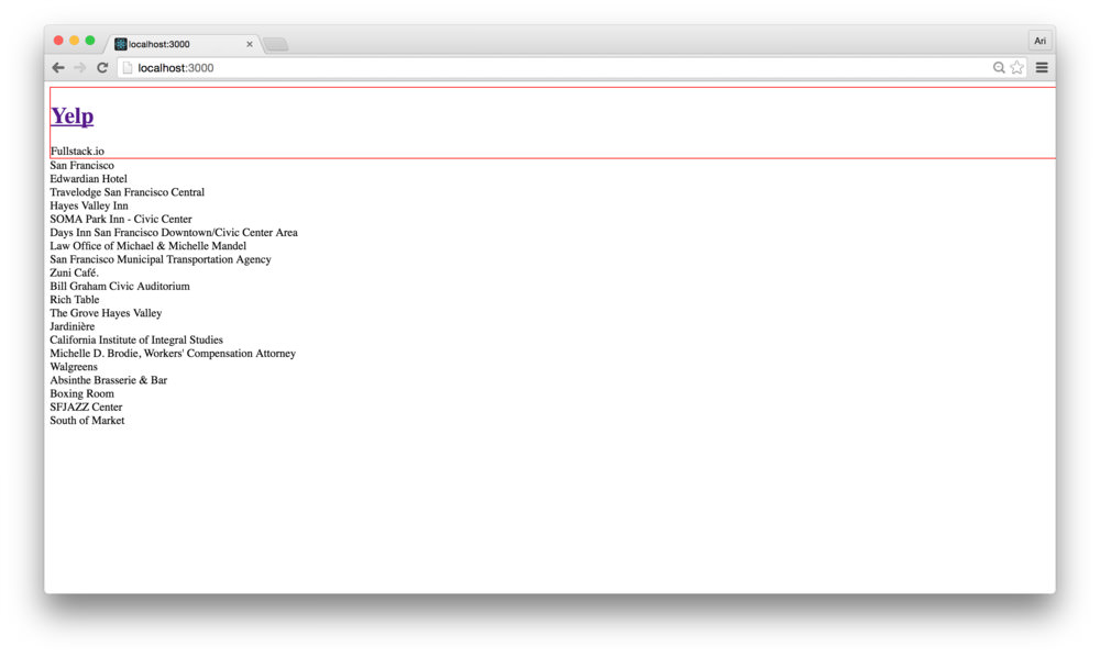
}By setting the styles.topbar class to the
<Header /> component, the styles will be applied to
the component. With our border in the styles.topbar class,
we’ll see we have a red border around our topbar:
Let’s go ahead and add a fixed style to make it look a little nicer:
/* In `src/components/Header/styles.module.css `*/
.topbar {
  position: fixed;
  z-index: 10;
  top: 0;
  left: 0;
  background: #48b5e9;
  width: 100%;
  padding: 0 25px;
  height: 80px;
  line-height: 80px;
  color: #fff;

  a {
    text-transform: uppercase;
    text-decoration: none;
    letter-spacing: 1px;

    line-height: 40px;
    h1 { font-size: 28px; }
  }
  section {
    position: absolute;
    top: 0px;
    right: 25px;
  }
}
Let’s also add a few styles to the main app.css (some
global styles to change the layout style and remove global padding).
Back in src/app.css, let’s add a few styles to help make
our top bar look decent:
*,
*:after,
*:before {
    box-sizing: border-box;
    -webkit-font-smoothing: antialiased;
    -moz-osx-font-smoothing: grayscale;
    font-smoothing: antialiased;
    text-rendering: optimizeLegibility;
    font-size: 16px;
}

body {
  color: #333333;
  font-weight: lighter;
  font: 400 15px/22px 'Open Sans', 'Helvetica Neue', Sans-serif;
  font-smoothing: antialiased;
  padding: 0;
  margin: 0;
}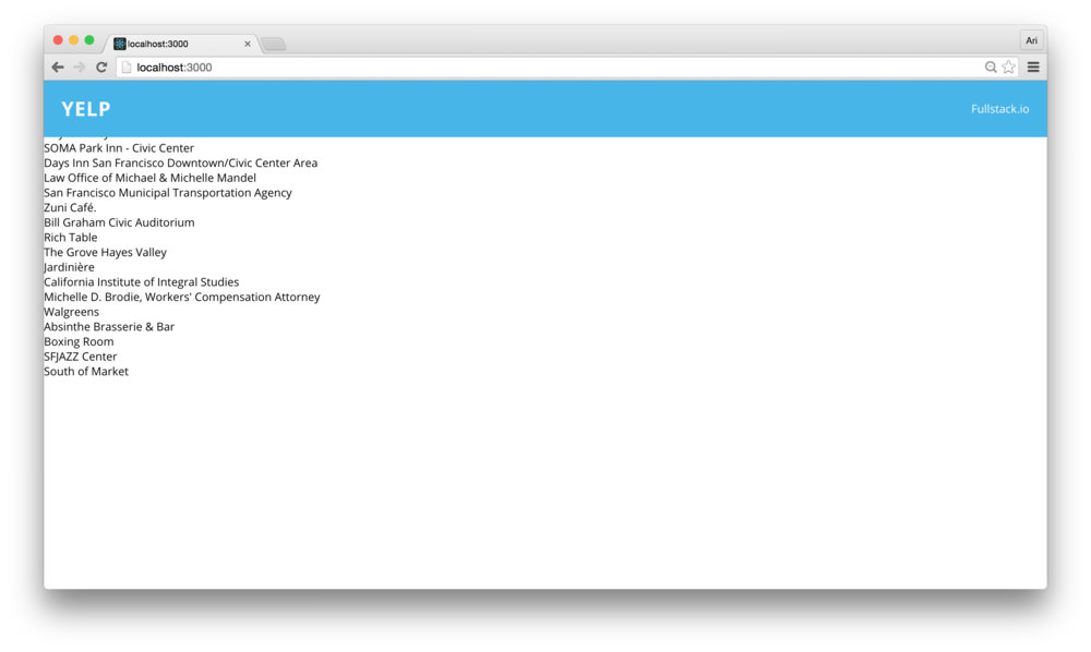
At this point, we can say that our header looks decent. However, with the way that we have it styled now, the content runs through the topbar. We can fix this by adding some styles to our content.
Let’s create a content css modules in our
src/views/Main/styles.module.css directory that our
<Container /> component will use.
touch src/views/Main/styles.module.cssIn here, we can wrap our entire container with a class and add a
content class, etc. In our new styles.module.css class,
let’s add the content classes:
.wrapper {
  overflow-y: scroll;
  display: flex;
  margin: 0;
  padding: 15px;

  height: 100vh;
  -webkit-box-orient: horizontal;
  -o-box-orient: horizontal;
}

.content {
  position: relative;
  flex: 2;
  top: 80px;
}
Setting
flex: 2sets our content box as the larger of the two elements (sidebar vs content). We’ll come back and look at this in more depth at the end of this article.
In the same fashion as we did before, we can now import these
container styles with the <Container /> component. In
our <Container /> component, let’s add a few styles
around the elements on the page:
import styles from './styles.module.css'

export class Container extends React.Component {
  // ...
  render() {
    return (
        <Map
          visible={false}
          className={styles.wrapper}>
          <Header />
          <div className={styles.content}>
            {/* contents */}
          </div>
        </Map>
      </div>
    )
  }
}
Notice above how we have some hardcoded values, such as the height in
our topbar class.
/* In `src/components/Header/styles.module.css `*/
.topbar {
  /* ... */
  background: #48b5e9;
  height: 80px;
  line-height: 80px;
  /* ... */
}
One of the valuable parts of using postcss with the postcss pipeline we’ve set up is that we can use variables in our css. There are a few different ways to handle using variables in CSS, but we’ll use the method that is built into postcss syntax.
To add a custom property (variable), we can prefix the variable name
with two dashes (-) inside of a rule. For instance:
.topbar {
  --height: 80px;
}
Note, when creating a custom property (which in our case is a variable), we need to place it inside a CSS rule.
We can then use the --height property/variable in our
css by using the var() notation. In our case, we can then
replace the height properties in our topbar class:
/* In `src/components/Header/styles.module.css `*/
.topbar {
  --height: 80px;
  /* ... */
  background: #48b5e9;
  height: var(--height);
  line-height: var(--height);
  /* ... */
}
Although this is all well and good, we’re limited to using this
--height variable to the .topbar class at this
point. Instead, if we want to use this height in say, the
content class, we’ll need to put the variable in a higher
DOM selector.
We could place the variable in the wrapper class, for
instance, but postcss has a more clever way of handling variable
notation. We can place the variable declaration at the root
node of the CSS using the :root selector:
/* In `src/components/Header/styles.module.css `*/
:root {
  --height: 80px;
}
.topbar {
  /* ... */
  height: var(--height);
  line-height: var(--height);
  /* ... */
}
Since we’ll likely want to use this within another css module, we can
place this variable declaration in another common css file that both
modules can import. Let’s create a root directory for our CSS variables
to live inside, such as src/styles/base.css:
touch src/styles/base.cssLet’s move our :root declaration into this
base.css file:
:root {
  --topbar-height: 80px;
}
To use this variable in our multiple css modules, we’ll import it at the top of our CSS module and use it as though it has been declared at the top of the local file.
Back in our src/components/Header/styles.module.css, we
can replace the :root definition with the import line:
@import url("../../styles/base.css");
/* ... */
.topbar {
  /* ... */
  height: var(--height);
  line-height: var(--height);
  /* ... */
}
Now, we have one place to change the height of the topbar and still have the variable cascade across our app.
With our topbar built, we can move to building the routes of our main application. Our app contains a sidebar and a changable content area that changes views upon changing context. That is, we’ll show a map to start out with and when our user clicks on a pin, we’ll change this to show details about the location the user has clicked on.
Let’s get started with the sidebar component that shows a listing of
the places. We’ve done the hardwork up through this point. The React
Way dictates that we define a component that uses a components to
display the view (components all the way down – weeee). What this
literally entails is that we’ll build a <Listing />
component that lists individual listing items. This way we can focus on
the detail for each item listing rather than needing to worry about it
from a high-level.
Let’s take our listing from a simple list to a
<Sidebar /> component. Since we’ll create the
component as a shared one, let’s add it in the
src/components/Sidebar directory. We’ll also create a
JavaScript file and the CSS module:
mkdir src/components/Sidebar
touch src/components/Sidebar/{Sidebar.js,styles.module.css}
The <Sidebar /> component will be a fairly simple
component that we can use to contain the listing of places and a wrapper
for a sticky sidebar. Let’s place it in our
<Container /> view initially, so we can get it listed
in the view. In our src/views/Main/Container.js file, let’s
import this new <Sidebar /> component (yet to be
built). Let’s import it and place it in our render()
function:
import Sidebar from 'components/Sidebar/Sidebar'

export class Container extends React.Component {
  // ...
  render() {
    return (
      <Map
        visible={false}
        className={styles.wrapper}>
        <Header />
        <Sidebar />
        {/* contents */}
      </Map>
    )
  }
}
We’ll also want to pass a few props into the
<Sidebar /> component. Since it is responsible for
listing our places, we’ll definitely need to pass in the list of places
we fetch from the google api. As of now, it’s stored in the
state of the <Container />. We’ll come
back to passing through a click handler (that gets called when a list
item is clicked). Modifying our implementation, let’s pass through these
props:
import Sidebar from 'components/Sidebar/Sidebar'

export class Container extends React.Component {
  // ...
  render() {
    return (
        <Map
          visible={false}
          className={styles.wrapper}>
          <Header />
          <Sidebar
            title={'Restaurants'}
            places={this.state.places}
            />
          {/* contents */}
        </Map>
      </div>
    )
  }
}
With our <Sidebar /> component in the
<Container />, let’s start building our
<Sidebar />. The component will mostly be used as a
container to hold styles and dynamic data.
import React, { PropTypes as T } from 'react'
import styles from './styles.module.css'

export class Sidebar extends React.Component {
  render() {
    return (
      <div className={styles.sidebar}>
        <div className={styles.heading}>
          <h1>{this.props.title}</h1>
        </div>
      </div>
    )
  }
}

export default Sidebar
Let’s also make sure we add the appropriate top positioning such that
it isn’t rendered underneath the topbar. Let’s create the
styles in src/components/Sidebar/styles.module.css and add
some styles:
@import url("../../styles/base.css");

.sidebar {
  height: 100%;
  top: var(--topbar-height);
  left: 0;
  overflow: hidden;

  position: relative;
  flex: 1;
  z-index: 0;

  .heading {
    flex: 1;
    background: #fff;
    border-bottom: 1px solid #eee;
    padding: 0 10px;

    h1 {
      font-size: 1.8em;
    }
  }
}
Our <Sidebar /> component so far is
straightforward and currently only renders the title prop
we passed it above. Currently, we don’t have much interesting going on
with our <Sidebar /> component. Let’s pass through
our details to a new <Listing /> component.
We could display the listing directly inside the
<Sidebar />component, but this would not be the React Way.
Let’s create a <Listing /> component to list each
place. We’ll use an additional component called
<Item /> to handle listing each individual item. That
being said, let’s build the <Listing /> component.
We’ll make the components, a css module, and the tests to go along with
it:
mkdir src/components/Listing
touch src/components/Listing/{Listing.js,Item.js,styles.module.css}
touch src/components/Listing/{Listing.spec.js,Item.spec.js}
Since we’re doing some test driven development, let’s get our
Listing.spec.js updated. The assumptions we’ll make about
our <Listing /> component is that it has the styles
we expect and that it lists an <Item /> component for
each place in our places prop. The test can be stubbed as
follows:
import React from 'react'
import { expect } from 'chai'
import { shallow } from 'enzyme'

import Listing from './Listing'
import styles from './styles.module.css'

describe('<Listing />', () => {
  let wrapper;
  const places = [{
    name: 'Chicago'
  }, {
    name: "San Francisco"
  }];

  beforeEach(() => {
    wrapper = shallow(<Listing places={places} />)
  });

  it('wraps the component in a listing css class')
  it('has an item for each place in the places prop')
})
Let’s go ahead and fill out these tests. It’s okay that they will
ultimately fail when we run them at first (we haven’t implemented either
the <Listing /> or the <Item />
components yet). The final tests will look like:
import React from 'react'
import { expect } from 'chai'
import { shallow } from 'enzyme'

import Listing from './Listing'
import styles from './styles.module.css'

describe('<Listing />', () => {
  let wrapper;
  const places = [{
    name: 'Chicago'
  }, {
    name: "San Francisco"
  }];
  beforeEach(() => {
    wrapper = shallow(<Listing title={'Cafes'}
                      places={places} />)
  });

  it('wraps the component in a listing css class', () => {
    expect(wrapper.find(`.${styles.container}`))
      .to.be.defined;
  })
  it('has an item for each place in the places prop', () => {
    expect(wrapper.find('Item').length)
      .to.equal(places.length);
  })
})Listing
ComponentWith the <Listing /> component tests written,
let’s turn our sights on implementing the <Listing />
component. Similar to the <Sidebar /> component, the
<Listing /> component serves basically as a wrapper
around the <Item /> component with styles. At it’s
core, we simply need a wrapper component around a listing of
<Item /> components.
Our entire component will be fairly short and simple.
import React, { PropTypes as T } from 'react'
import classnames from 'classnames'

import Item from './Item';
import styles from './styles.module.css'

export class Listing extends React.Component {
  render() {
    return (
      <div className={classnames(styles.container)}>
      {this.props.places.map(place => {
        return (
          <Item place={place}
                onClick={this.props.onClick}
                key={place.id} />
        )
      })}
      </div>
    )
  }
}

export default Listing
Let’s create the container style inside the css module
for the <Listing /> component. In our
src/components/Listing/styles.module.css, let’s make sure
we have a CSS container that removes some basic styling.
.container {
  height: 100%;
  overflow: auto;
  padding-bottom: 60px;
  margin: 0;
}
Before we can depend upon the view changing with our updated
<Listing /> component, we’ll need to write up our
<Item /> component.
Item ComponentThe expectations we’ll make with our <Item />
component will be that it shows the name of the place, that it is styled
with the appropriate class, and that it shows a rating (given by the
Google API). In our src/components/Listing/Item.spec.js,
let’s stub out these assumptions as a Jasmine test:
import React from 'react'
import { expect } from 'chai'
import { shallow } from 'enzyme'

import Item from './Item'
import styles from './styles.module.css'

describe('<Item />', () => {
  let wrapper;
  const place = {
    name: 'San Francisco'
  }
  beforeEach(() => {
    wrapper = shallow(<Item place={place} />)
  });

  it('contains a title component with yelp')
  it('wraps the component with an .item css class')
  it('contains a rating')
})
Let’s fill up these tests. The tests themselves are straightforward.
// ...
it('contains a title component with yelp', () => {
  expect(wrapper.find('h1').first().text())
    .to.equal(place.name)
});

it('wraps the component with an .item css class', () => {
  expect(wrapper.find(`.${styles.item}`))
    .to.have.length(1);
})

it('contains a rating', () => {
  expect(wrapper.find('Rating'))
    .to.be.defined;
});
It may be obvious at this point, but we’ll create another component
we’ll call <Rating /> which will encapsulate the
ratings on a place given back to us through the Google API. For the time
being, let’s turn these tests green.
In our src/components/Listing/Item.js. Our
<Item /> component won’t need to worry about fetching
a place or dealing with the API, since we’ll be passing through the
place object when we mount it. We’ll display the name of the place along
with it’s rating. Before we get to building our
<Rating /> component, let’s build up our
<Item /> component to display the name and it’s
rating by number.
import React, { PropTypes as T } from 'react'
import classnames from 'classnames'

import Rating from 'components/Rating/Rating';
import styles from './styles.module.css'

export class Item extends React.Component {
  render() {
    const {place} = this.props;
    return (
      <div
        className={styles.item}>
          <h1 className={classnames(styles.title)}>{place.name}</h1>
          <span>{place.rating/5}</span>
      </div>
    )
  }
}

export default Item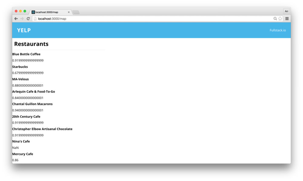
In order to style the <Item /> component, let’s
create the .item class in the css module at
src/components/Listing/styles.module.css. We’ll use flexbox
to design our <Item /> listing which contains the two
elements:
/* ... */
.item {
  display: flex;
  flex-direction: row;
  border-bottom: 1px solid #eeeeee;
  padding: 10px;
  text-decoration: none;

  h1 {
    flex: 2;
    &:hover {
      color: $highlight;
    }
  }

  .rating {
    text-align: right;
    flex: 1;
  }

  &:last-child {
    border-bottom: none;
  }
}
Now, back in our view, we’ll see that the ratings are starting to take shape:
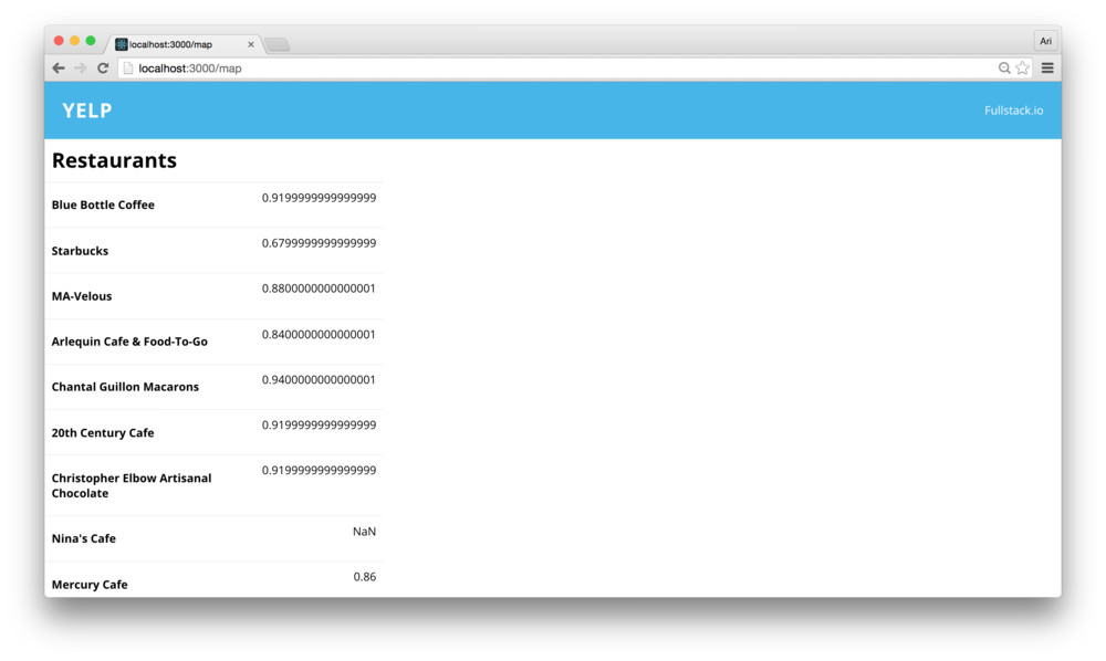
Let’s get the ratings looking a little nicer. We’ll use stars to
handle the rating numbering (rather than the ugly decimal points – ew).
Since we’re going to make a <Rating /> component,
let’s create it in the src/components directory. We’ll
create the module, the css module, and the tests:
mkdir src/components/Rating
touch src/components/Rating/{Rating.js,styles.module.css}
touch src/components/Rating/Rating.spec.js
The assumptions we’ll make with the <Rating />
component is that we will have two layers of CSS elements and
that the first one will fill up the stars at a percentage of
the rating.
With these expectations, the test skeleton will look akin to:
import React from 'react'
import {expect} from 'chai'
import {shallow} from 'enzyme'

import Rating from './Rating'
import styles from './styles.module.css';

describe('<Rating />', function () {
  it('fills the percentage as style');
  it('renders bottom and top star meters')
});
Let’s fill up these tests. We’ll shallow-mount each of the components
in each test and make sure that the CSS style that’s attached matches
our expectations. We’ll use percentage to display the
rating percentage (from 0 to 5).
// ...
it('fills the percentage as style', () => {
  let wrapper = shallow(<Rating percentage={0.10} />)
  expect(wrapper.find(`.${styles.top}`))
    .to.have.style('width', '10%');

  wrapper = shallow(<Rating percentage={0.99} />)
  expect(wrapper.find(`.${styles.top}`))
    .to.have.style('width', '99%')

  let rating = 4;
  wrapper = shallow(<Rating percentage={rating/5} />)
  expect(wrapper.find(`.${styles.top}`))
      .to.have.style('width', '90%')
});

it('renders bottom and top star meters', () => {
  let wrapper = shallow(<Rating percentage={0.99} />)
  expect(wrapper.find(`.${styles.top}`)).to.be.present;
  expect(wrapper.find(`.${styles.bottom}`)).to.be.present;
})
Our tests will fail while we haven’t actually implemented the
<Rating /> component. Let’s go ahead and turn our
tests green. The <Rating /> component is
straightforward in that we’ll have two levels of Rating icons
with some style splashed on to display the stars.
In our src/components/Rating/Rating.js file, let’s
create a stateless <RatingIcon /> component along
with our <Rating /> component:
import React, { PropTypes as T } from 'react'
import styles from './styles.module.css';

const RatingIcon = (props) => (<span>★</span>)

export class Rating extends React.Component {
  render() {
    // ...
  }
}

export default Rating
The
<RatingIcon />can be a stateless component as its output is not dependent upon the props. It simply shows a star (*).
We can use this <RatingIcon /> component inside
our <Rating /> component. We’ll use inline style to
set the width of the top colored rating icons. In our
src/components/Rating/Rating.js, let’s update the
<Rating /> component to use the
<RatingIcon /> component:
export class Rating extends React.Component {
  render() {
    const {percentage} = this.props;
    const style = {
      width: `${(percentage || 0) * 100}%`
    }
    return (
      <div className={styles.sprite}>
        <div className={styles.top} style={style}>
            <RatingIcon />
            <RatingIcon />
            <RatingIcon />
            <RatingIcon />
            <RatingIcon />
        </div>
        <div className={styles.bottom}>
          <RatingIcon />
          <RatingIcon />
          <RatingIcon />
          <RatingIcon />
          <RatingIcon />
        </div>
      </div>
    )
  }
}
Without any style, the <Rating /> component
doesn’t look quite like a rating.
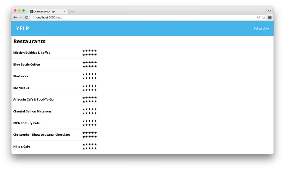
Let’s fix the styling to separate the top and the bottom part of the components.
.sprite {
  unicode-bidi: bidi-override;
  color: #404040;
  font-size: 25px;
  height: 25px;
  width: 100px;
  margin: 0 auto;
  position: relative;
  padding: 0;
  text-shadow: 0px 1px 0 var(--light-gray);
}

.top {
  color: #48b5e9;
  padding: 0;
  position: absolute;
  z-index: 1;
  display: block;
  top: 0;
  left: 0;
  overflow: hidden;
}

.bottom {
  padding: 0;
  display: block;
  z-index: 0;
  color: #a2a2a2;
}Before we move on, let’s make sure we have our colors as a variable
as well. This way, we can ensure our colors across our app are
consistent. Let’s create a src/styles/colors.css file to
keep our colors as variables. As we did previously with our
base.css, let’s keep these styles in the :root
component.
In src/styles/colors.css, let’s set our colors:
:root {
  --dark: #404040;
  --light-gray: #a2a2a2;
  --white: #ffffff;
  --highlight: #48b5e9;
  --heading-color: var(--highlight);
}
With these colors set, let’s convert our
<Rating /> component’s css module to use them
(remembering to import the src/styles/colors.css file):
@import "../../styles/colors.css";

.sprite {
  unicode-bidi: bidi-override;
  color: var(--dark);
  font-size: 25px;
  height: 25px;
  width: 100px;
  margin: 0 auto;
  position: relative;
  padding: 0;
  text-shadow: 0px 1px 0 var(--light-gray);
}

.top {
  color: var(--highlight);
  padding: 0;
  position: absolute;
  z-index: 1;
  display: block;
  top: 0;
  left: 0;
  overflow: hidden;
}

.bottom {
  padding: 0;
  display: block;
  z-index: 0;
  color: var(--light-gray);
}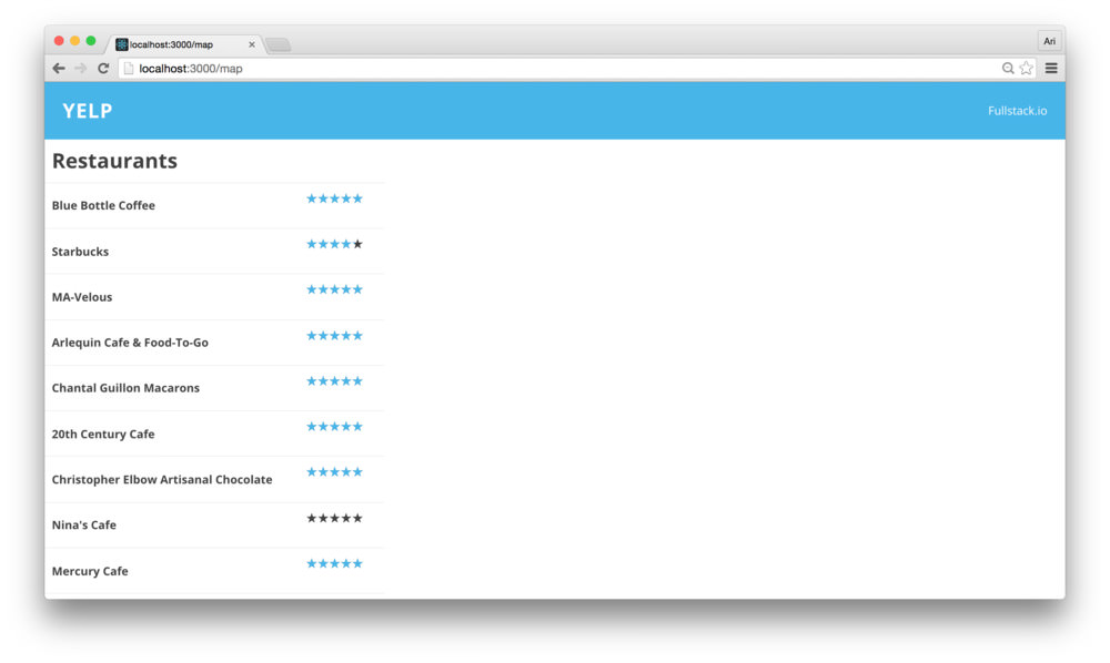
Now our <Sidebar /> with our
<Listing /> component is complete.
Sidebar with
ListingsNow that we have our <Sidebar /> implemented,
let’s build up our main elements. That is, let’s show our map and
details. Since we’ll want these pages to be linkable, that is we want
our users to be able to copy and paste the URL and see the same URL as
they expect, we’ll set the main content to be defined by it’s URL.
In order to set these elements up to be handled by their routes,
we’ll need to change our routes. Currently, our routes are set by a
single route that shows the <Container /> component.
Let’s modify the route to show both a Map component and
details.
Our src/views/Main/routes.js file currently only
contains a single <Route /> component. As a reminder,
it currently looks like:
import React from 'react'
import {Route} from 'react-router'
import Container from './Container'

export const makeMainRoutes = () => {

  return (
    <Route path="" component={Container} />
  )
}

export default makeMainRoutes;
Let’s modify the makeMainRoutes() function to set the
<Container /> component as a container
(surprise) for the main routes.
export const makeMainRoutes = () => {

  return (
    <Route path="" component={Container}>
      {/* child routes in here */}
    </Route>
  )
}
Now, let’s build the <Map /> container we will
surface in this area. We’ll build this <Map />
component in the src/views/Main/Map directory, so let’s
import the exported component in our makeMainRoutes() file
and list it as a child:
import Map from './Map/Map'
export const makeMainRoutes = () => {

  return (
    <Route path="" component={Container}>
      <Route path="map" component={Map} />
    </Route>
  )
}
Loading our new routes in the browser will show nothing until we
navigate to the /map route AND we build our component. For
the time being, let’s create a simple <Map />
component to show in the Map area to confirm the route is working.
As we’ve done a few times already, let’s create a JS file and the css
module file in the src/views/Main/Map directory:
mkdir src/views/Main/Map
touch src/views/Main/Map/{styles.module.css,Map.js}
A really simple default <Map /> component
with some dummy text is pretty simple to create
import React, { PropTypes as T } from 'react'
import classnames from 'classnames'

import styles from './styles.module.css'

export class MapComponent extends React.Component {
  render() {
    return (
      <div className={styles.map}>
        MAP!
      </div>
    )
  }
}

export default MapComponent
Heading back to the browser, we’ll see that… wait, it’s
blank? Why? We haven’t told the <Container />
component how or where to render it’s child routes. Before we can go
much further, we’ll need to share our expectations with the
component.
The React Way to handle this is by using the
children prop of a component. The
this.props.children prop is handed to the React component
when it mounts for any nodes that are rendered as a child of a React
component. We’ll use the children prop to pass forward our
child routes to be rendered within the container.
To use the children prop, let’s modify the
<Container /> component in
src/views/Main/Container.js to pass them down inside the
content block.
export class Container extends React.Component {
  // ...
  render() {
    return (
        <Map
          visible={false}
          className={styles.wrapper}>
          <Header />
          <Sidebar />
          <div className={styles.content}>
            {/* Setting children routes to be rendered*/}
            {this.props.children}
          </div>
        </Map>
      </div>
    )
  }
}
Now, when we load the view in the browser we’ll see that the route
for /map inside the content block.
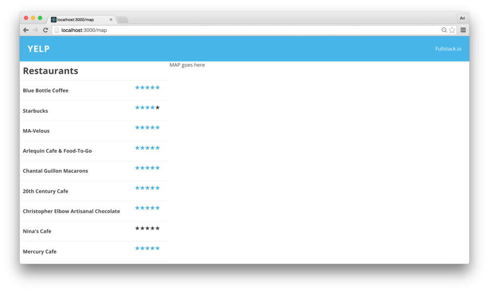
Since we are already loading the <Map /> container
in the outer <Container /> component, we will already
have a handle to the google reference as well as a
reference to a created map instance. We can pass the
reference down as a prop to the child elements by cloning
children and creating a new instance to handle passing down data.
React makes this process easy to handle by using the
React.cloneElement() function. In our render()
method of the <Container /> component, let’s get a
handle to the children props outside of the
<Map /> component:
export class Container extends React.Component {
  // ...
  render() {
    let children = null;
    if (this.props.children) {
      // We have children in the Container component
      children = this.props.children;
    }
    return (
      {/* shortened for simplicity */}
      <div className={styles.content}>
        {/* Setting children routes to be rendered*/}
        {children}
      </div>
    )
  }
}
With a handle to the children props, we can create a clone of them passing the new props down to the children, for instance:
export class Container extends React.Component {
  // ...
  render() {
    let children = null;
    if (this.props.children) {
      // We have children in the Container component
      children = React.cloneElement(
        this.props.children,
        {
          google: this.props.google
        });
    }
    return (
      {/* shortened for simplicity */}
      <div className={styles.content}>
        {/* Setting children routes to be rendered*/}
        {children}
      </div>
    )
  }
}
Now, the children of the <Container /> component
will receive the google prop. Of course, we also will have
to pass the places from the state of the
<Container /> component. We can pass any other data
we want to send off within the React.cloneElement()
function. We’ll pass as much data down as we need to here, which we’ll
take advantage of a bit later.
export class Container extends React.Component {
  // ...
  render() {
    let children = null;
    if (this.props.children) {
      // We have children in the Container component
      children = React.cloneElement(
        this.props.children,
        {
          google: this.props.google,
          places: this.state.places,
          loaded: this.props.loaded
        });
    }
    return (
      {/* shortened for simplicity */}
      <div className={styles.content}>
        {/* Setting children routes to be rendered*/}
        {children}
      </div>
    )
  }
}
Now, we can update our <Map /> component (in
src/views/Main/Map/Map.js) to show an actual
<Map /> from our GoogleApiComponent()
container using the google props:
import React, { PropTypes as T } from 'react'
import classnames from 'classnames'
import Map from 'google-maps-react'

import styles from './styles.module.css'

export class MapComponent extends React.Component {
  render() {
    return (
      <Map google={this.props.google}
            className={styles.map}
            >
      </Map>
    )
  }
}

export default MapComponent
The <MapComponent /> here will work as expected as
we are already creating the google component (in fact, we can also pass
the map prop down and the GoogleApiComponent
npm module will handle it correctly without creating a new map
instance).
Markers On
Our MapLet’s get some <Markers /> on our
<MapComponent /> component. The
GoogleApiComponent HOC decorates it’s children elements
with the appropriate props passed by the <Map />
component (provided it’s the parent component).
That is, we can render <Marker /> components from
inside the <Map /> component as children. In our
<MapComponent /> component, we can use a similar
process to the <Container /> element to render the
child props. Since we’ll want to display a <Marker />
for each place, we will iterate through the
this.props.places array and instantiate a new
<Marker /> instance for each.
Let’s create the instances using a method we’ll handle the children rendering using a helper function:
export class MapComponent extends React.Component {
  renderMarkers() {

  }
  render() {
    return (
      <Map google={this.props.google}
            className={styles.map}>
        {this.renderMarkers()}
      </Map>
    )
  }
}
To create the Marker, let’s import the <Marker />
component from the google-maps-react npm module:
import Map, { Marker } from 'google-maps-react'Now, inside the renderMarkers() function we can iterate
over the this.props.places prop and create a
<Marker /> instance:
export class MapComponent extends React.Component {
  renderMarkers() {
    return this.props.places.map(place =>{
      return <Marker key={place.id}
                name={place.id}
                place={place}
                position={place.geometry.location}
              />
    })
  }
  // ...
}
Loading this in the browser, we’ll see that our
this.props.places is null and this method will throw an
error (there are multiple ways to handle this, we’ll use a simple
check). We can avoid this check by returning null if there are no places
at the beginning of the function:
export class MapComponent extends React.Component {
  renderMarkers() {
    if (!this.props.places) { return null; }
    return this.props.places.map(place =>{
      return <Marker key={place.id}
                name={place.id}
                position={place.geometry.location}
              />
    })
  }
  // ...
}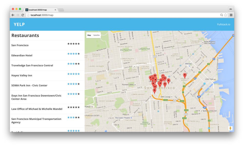
Now, we have our <Marker /> component showing
markers for each of the places in the map. With the
<Map /> component set up, let’s move on to handling
settling the screen that shows more details about each place after we
click on the marker that corresponds to the place.
<MapComponent /> childrenSince we’ll be updating all the children in the
<Map />, not just the Markers, this is a good time to
“abstract” the children rendering function. Without rendering it’s
children, none of our additional child components will render.
Let’s create a renderChildren() function inside the
<MapComponent /> to take any children in the
<MapComponent /> and clone each of the children with
the map and google props.
export class MapComponent extends React.Component {
  renderChildren() {
    const {children} = this.props;
    // ...
  }
  renderMarkers() {
    // ...
  }
  render() {
    return (
      <Map google={this.props.google}
            className={styles.map}>
        {this.renderChildren()}
      </Map>
    )
  }
}MarkersFor each of the <Marker /> components, we can
listen for onClick events and run a function when it’s
clicked. We can use this functionality to route the user to a
new path that is designed to show details specifically about a single
place from the Google API.
Since we’re handling most of the business logic in the
<Container /> and we are mostly using the
<MapComponent /> as a non-stateful component, we’ll
put this logic inside the containing <Container />
component, as opposed to the <MapComponent />.
Containing the entire routing logic in the
<Container />component is a simple way to keep the business logic of the application in a single spot and not clutter up other components. Plus, it makes testing the components way simpler.
Just like we can pass through data in the props of a
component, we can pass down function references as well. Let’s take the
call to React.cloneElement() and pass through a reference
to a function that will get called when one is clicked. Let’s call it
onMarkerClick() (obvious name for the function, eh?).
Let’s open up our <Container /> element in
src/views/Main/Container.js and add the function as well as
the prop to the children:
export class Container extends React.Component {
  // ...
  onMarkerClick(item) {

  }

  render() {
    let children = null;
    if (this.props.children) {
      // We have children in the Container component
      children = React.cloneElement(
        this.props.children,
        {
          google: this.props.google,
          places: this.state.places,
          loaded: this.props.loaded,
          onMarkerClick: this.onMarkerClick.bind(this)
        });
    }
    // ...
  }
}
To use our new onMarkerClick prop, we can pass it
through to the onClick() method in the
<Marker /> component. The
<Marker /> component accepts a click handler through
the onClick prop. We can pass through the prop
directly to the <Marker /> component.
Back in the <MapComponent /> (at
src/views/Main/Map/Map.js), let’s update the
<Marker /> component with the onClick
prop to call back to our onMarkerClick prop (that is a
mouthful):
export class MapComponent extends React.Component {
  renderMarkers() {
    return this.props.places.map(place =>{
      return <Marker key={place.id}
                name={place.id}
                place={place}
                onClick={this.props.onMarkerClick.bind(this)}
                position={place.geometry.location}
              />
    })
  }
  // ...
}
Now, when a <Marker /> is clicked, it will call
our <Container /> component’s
onMarkerClick() function. The callback it executes is
called with the instance of the <Marker /> component,
along with the map and google instance. We’ll only need to work with the
<Marker /> instance as we have all the information
passed through in props.
Since we pass the place object in the
<Marker /> component, we can reference the entire
place object in the callback.
export class Container extends React.Component {
  // ...
  onMarkerClick(item) {
    const {place} = item; // place prop
  }
  // ...
}
When our user clicks on the marker, we’ll want to send them to a different route, the details route.
To define this, we’ll use the router in the
<Container /> component’s context to push
the user’s browser to another route. In order to get access to the
context of the <Container /> component,
we’ll need to define the contextTypes. We’ll be using a
single context in our contextTypes. At the end of the
src/views/Main/Container.js file, let’s set the
router to the type of object:
export class Container extends React.Component {
  // ...
}
Container.contextTypes = {
  router: React.PropTypes.object
}
Now, inside the onMarkerClick() function we can get
access to the push() method from the router context and
call it with the destination route:
export class Container extends React.Component {
  // ...
  onMarkerClick(item) {
    const {place} = item; // place prop
    const {push} = this.context.router;
    push(`/map/detail/${place.place_id}`)
  }
  // ...
}
Now, clicking on a marker will push us to a new route, the
/map/detail/${place.place_id} route.
MarkersLet’s create the /detail/:placeId route. When our user
navigates to a URL like /detail/abc123, instead of
/map, we’ll want to show them the details for the place
with the id of abc123. This scheme allows us to copy and
paste the URL so the user can share it around and expect to see the same
result every single time.
To create the new route, let’s modify the routes.js file
so that we have this route. In our src/views/Main/routes.js
file, let’s add:
export const makeMainRoutes = () => {

  return (
    <Route path="" component={Container}>
      <Route path="map" component={Map} />
      <Route path="detail/:placeId"
            component={Detail} />
    </Route>
  )
}
React router takes the final part of the URL and treats it as a
variable route. That is to say if the user visits a url such as:
/detail/abc123, it will match our new route and the
:placeId will be passed through as props to our
Detail component as params. We’ll come back to
this in a moment.
Let’s create the Detail component and it’s css module
(just like we did previously for the <Map />
component):
mkdir src/views/Main/Detail
touch src/views/Main/Detail/{styles.module.css,Detail.js}
The <Detail /> component is a single component
that is responsible for showing the data associated with a place. In
order to handle finding more details about the place, we can call
another Google API that directly gives us details about one specific
place.
Let’s create this API handler in our
src/utils/googleApiHelpers.js (as we have done with the
nearbySearch()). Let’s add the following request at the end
of the file:
export function getDetails(google, map, placeId) {
  return new Promise((resolve, reject) => {
    const service = new google.maps.places.PlacesService(map);
    const request = {placeId}

    service.getDetails(request, (place, status) => {
      if (status !== google.maps.places.PlacesServiceStatus.OK) {
        return reject(status);
      } else {
        resolve(place);
      }
    })
  })
}
Let’s create the <Detail /> component, making sure
to import our new helper function (which we’ll use shortly). In the
src/views/Main/Detail/Detail.js, let’s create the
component:
import React, { PropTypes as T } from 'react'
import {getDetails} from 'utils/googleApiHelpers'
import styles from './styles.module.css'

export class Detail extends React.Component {
  constructor(props, context) {
    super(props, context)

    this.state = {
      loading: true,
      place: {},
      location: {}
    }
  }

  getDetails(map) {}
  // ...
  render() {
    return (
      <div className={styles.details}></div>
    )
  }
}

export default Detail
The <Detail /> component is a stateful
component as we’ll need to hold on to the result of an API fetch to the
getDetails() request. In the constructor, we’ve set the
state to hold on to a few values, including the loading state of the
request.
We have to handle two cases for when the
<Detail /> component mounts or updates in the
view.
<Detail /> mounts
initially, we’ll want to make a request to fetch more details about the
place identified by the :placeId.placeId changes.In either case, we’ll need a common method for getting details. Let’s
update our getDetails() method inside the
<Detail /> component that we’ll call our helper
method of the same name. First, let’s get the placeId from
the URL (passed to our component through
this.props.params):
import {getDetails} from 'utils/googleApiHelpers'

export class Detail extends React.Component {
  getDetails(map) {
    // the placeId comes from the URL, passed into
    // this component through params
    const {google, params} = this.props;
    const {placeId} = params;
  }
  // ...
}
With the placeId, we can call our helper method and
store the result from the returned promise:
import {getDetails} from 'utils/googleApiHelpers'

export class Detail extends React.Component {
  getDetails(map) {
    // the placeId comes from the URL, passed into
    // this component through params
    const {google, params} = this.props;
    const {placeId} = params;

    // Set the loading state
    this.setState({loading: true}, () => {
      getDetails(google, map, placeId)
      .then(place => {
        const {location} = place.geometry;
        const loc = {
          lat: location.lat(),
          lng: location.lng()
        }

        this.setState({
          place, location: loc, loading: false
        });
      })
    });
  }
  // ...
}
Although it looks like quite a bit, the method is straight-forward. We’re setting the state as loading (so we can show the loading state in the view) and then calling the method. When it comes back successfully, we’ll update the state with the place/location and update the loading state.
We’re storing the
locationas a custom state object to standardize thelocation, rather than creating the object in therender()function.
Back to the two states, the first one is easy to handle. When the
componentDidMount(), we can check to see if we have a
map available in the props (we won’t have a
map prop if the <Map /> has yet to load – it’s
asynchronous, after all) and call our getDetails()
method.
In the src/views/Main/Detail/Detail.js, let’s add the
componentDidMount() function:
// ...
export class Detail extends React.Component {
  componentDidMount() {
    if (this.props.map) {
      this.getDetails(this.props.map);
    }
  }
  getDetails(map) {
    // ...
  }
}
The second case is relatively straight-forward as well. The component
will update when the props update, which in our case might
happen when the map is loading or the placeId changes in
the URL. If either one of those are true, we’ll call through to our
getDetails() method:
// ...
export class Detail extends React.Component {
  componentDidUpdate(prevProps) {
    if (this.props.map &&  // make sure we have a map
      (prevProps.map !== this.props.map ||
      prevProps.params.placeId !== this.props.params.placeId)) {
        this.getDetails(this.props.map);
    }
  }
  getDetails(map) {
    // ...
  }
}
With that, we’ll have the place details in the
this.state of the <Details /> component
ready for rendering.
If we’re in a loading state (i.e. this.state.loading is
true), we’ll show the user that we’re loading the page. We’ll set this
up simply in the render() function in our
<Details /> component:
export class Detail extends React.Component {
  // ...
  render() {
    if (this.state.loading) {
      return (<div className={styles.wrapper})>
                Loading...
              </div>);
    }
    // We're no longer loading when we get here
  }
}
Let’s show the place’s name, which we now have in the
this.state.place:
export class Detail extends React.Component {
  // ...
  render() {
    if (this.state.loading) {
      return (<div className={styles.wrapper})>
                Loading...
              </div>);
    }
    // We're no longer loading when we get here
    const {place} = this.state;
    return (
      <div className={styles.wrapper}>
        <h2>{place.name}</h2>
      </div>
    )
  }
}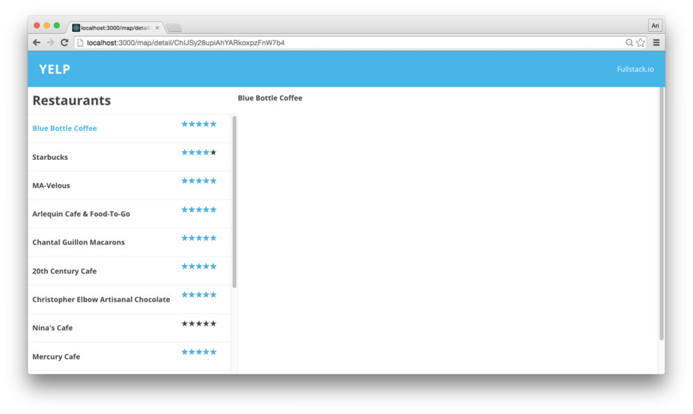
Before we move on, let’s add a small bit of style to the
<Detail /> component. Mostly for demonstration
purposes as well as making our app responsive. Before we get
there, let’s wrap our <h2> element in the
header class so we can modify the style and it’s
container:
export class Detail extends React.Component {
  // ...
  render() {
    if (this.state.loading) {
      return (<div className={styles.wrapper})>
                Loading...
              </div>);
    }
    // We're no longer loading when we get here
    const {place} = this.state;
    return (
      <div className={styles.wrapper}>
        <div className={styles.header}>
          <h2>{place.name}</h2>
        </div>
      </div>
    )
  }
}
Back in our src/views/Main/Detail/styles.module.css, we
can add the .header{} CSS class definition to give it some
definition. Let’s increase the font-size and add some padding around the
title to make it stand out more:
.header {
  padding: 0 25px;
  h2 {
    font-size: 1.5em;
  }
}
Remember, we can use the same padding across the entire app for
consistency, so rather than hard-code the padding in the header, let’s
use the globally defined variable --padding. First, we’ll
need to import the base style and then use the var() syntax
to apply the --padding:
@import url("../../../styles/base.css");

.header {
  padding: 0 var(--padding);
  h2 {
    font-size: 1.5em;
  }
}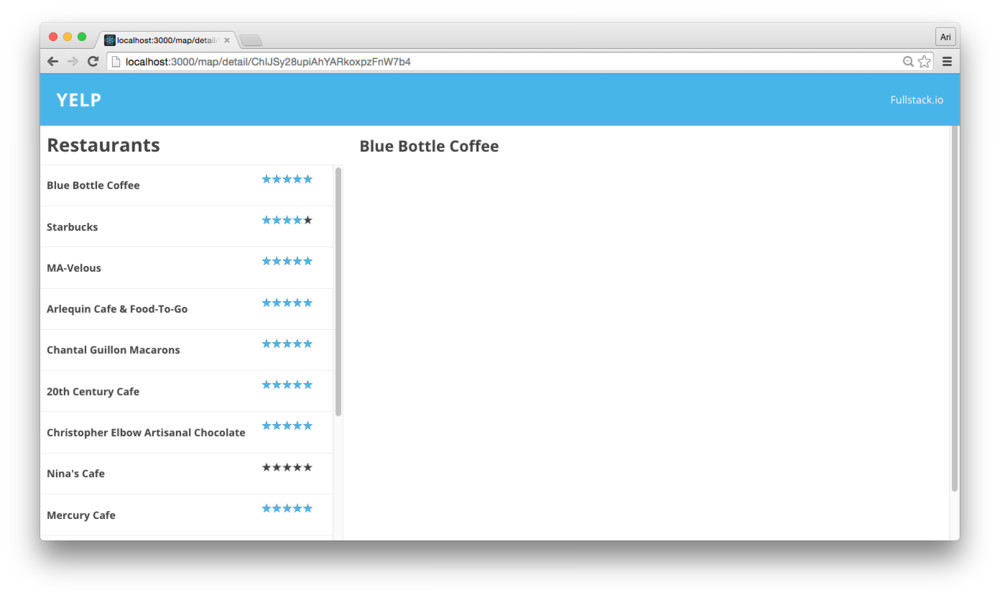
Although this style addition isn’t incredibly impressive, we now have
confirmed the css module is hooked up to our
<Detail /> component.
The Google Places API gives us back an interesting object with all sorts of fun goodies included, such as photos. Let’s get a photo panel showing the inside of the cafe (usually) that are handed back by API.
Let’s add in the photos to the render()
function of the <Details /> component. The Google API
doesn’t hand us back photo URLS, however. Instead, we’ll need to call
out to Google to give us a URL to display these photos. Luckily (and
well-designed), the Google JS SDK returns us a function we can call with
the maxWidth and maxHeight defined inside of
an object as an argument. We’ll use this to generate our URL.
Rather than display the photos inline to handle the process, let’s
nest the photo rendering in a function in the
<Detail /> component (we’ll call it
renderPhotos()):
export class Detail extends React.Component {
  // ...
  renderPhotos(place) {

  }
  render() {
    // ...
    const {place} = this.state;
    return (
      <div className={styles.wrapper}>
        <div className={styles.header}>
          <h2>{place.name}</h2>
        </div>
        <div className={styles.details}>
          {this.renderPhotos(place)}
        </div>
      </div>
    )
  }
}
An alternate way of handling photo rendering is by creating a component to take care of loading the photos. However, we’ll nest them in the
<Details />component to contain the<Detail />display to a single component.
Since some places don’t have photos, we’ll want to return back an empty virtual DOM node. Let’s check for this case:
export class Detail extends React.Component {
  // ...
  renderPhotos(place) {
    if (!place.photos || place.photos.length == 0) return;
    // We have photos here
  }
}
For each photo of the place’s photo array, we’ll pass back the generated URL (as we discussed above):
export class Detail extends React.Component {
  // ...
  renderPhotos(place) {
    if (!place.photos || place.photos.length == 0) return;
    const cfg = {maxWidth: 100, maxHeight: 100}
    return (<div className={styles.photoStrip}>
      {place.photos.map(p => {
        const url = `${p.getUrl(cfg)}.png`
        return (<img key={url} src={url} />)
      })}
    </div>)
  }
}
Checking our browser, we now have a beautiful photo spread… well, almost beautiful.
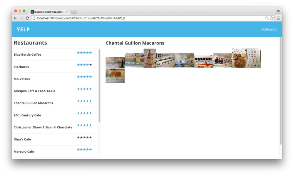
Let’s add some style to our already classNamed
photoStrip CSS class in our modules. First, let’s use
flexbox to make our photoStrip be a single, horizontally-scrollable line
of photos. In the same CSS file
(src/views/Main/Detail/styles.module.css), let’s add the
photoStrip CSS definition with flex:
.details {
  /* a little bit of padding */
  padding: 0 var(--padding);
  .photoStrip {
    flex: 1;
    display: flex;
    overflow: auto;
  }
}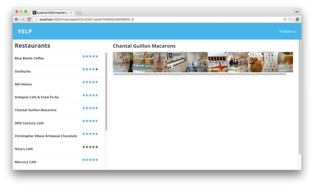
Annnnndddd let’s get rid of that awful scrollbar at the bottom of the
photoStrip by adding the ::-webkit-scrollbar CSS
definition:
.details {
  padding: 0 var(--padding);

  ::-webkit-scrollbar {
    width: 0px;
    background: transparent;
  }
  /* ... */
}
Finally, let’s add a small margin between the photos so we can see they are different photos instead of a single one:
.details {
  /* a little bit of padding */
  padding: 0 var(--padding);
  .photoStrip {
    flex: 1;
    display: flex;
    overflow: auto;

    img {
      margin: 0 1px;
    }
  }
}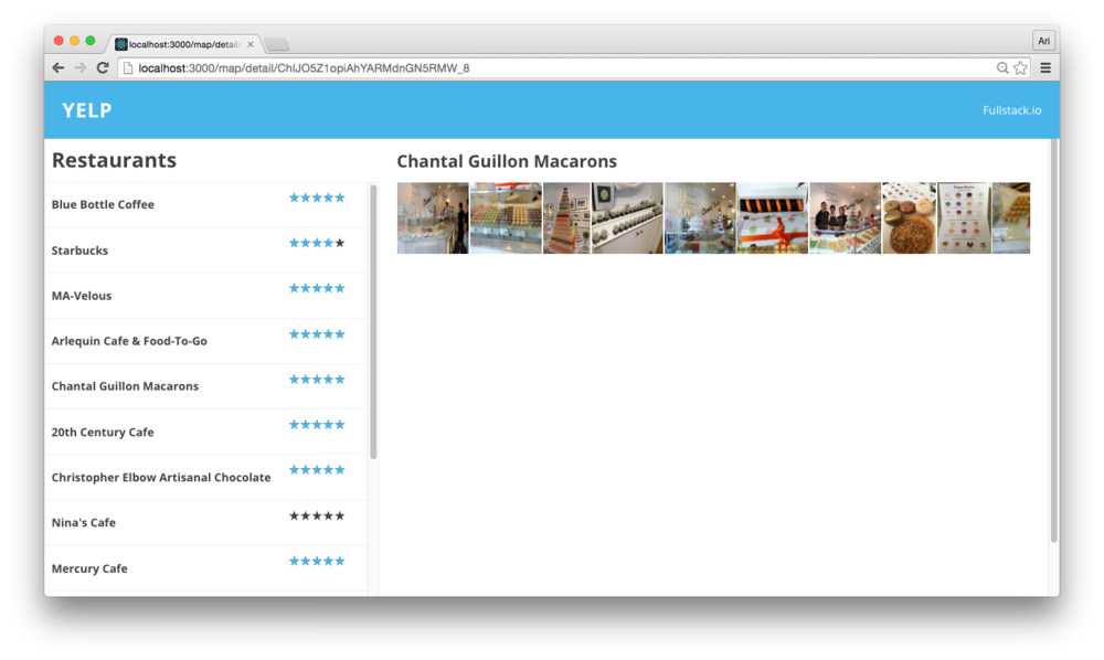
Our app looks great at a medium-sized to larger screen, but what if our user is using a mobile device to view our yelp-competitor?
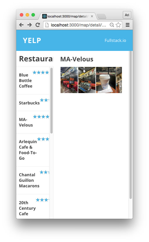
Let’s fix this right now. We will still want our list of other close-by restaurants showing, but perhaps the location makes sense below the details of the currently interesting one. It makes more sense for the list of restaurants to be below the details about a particular one or as a pull-out menu from the side.
To avoid adding extra JS work (and focus on the CSS responsiveness), let’s move the menu to below the detail of a specific location. In order to handle this, we’ll use some media queries.
Definition of Media query from w3c schools: Media query is a CSS technique introduced in CSS3. It uses the @media rule to include a block of CSS properties only if a certain condition is true.
We can use media queries to ask the browser to only display a CSS rule when a browser condition is true. For instance, we can use a media query to only set a font-size to 12px from 18px when we’re printing by using the sample CSS media query:
body { font-size: 18px; }
/* Media query for printing */
@media (print) {
  font-size: 12px;
}
/* ... */
In our postcss setup, we’re using the precss postcss (mouthful, right?) processor, which conveniently adds the postcss-custom-media plugin to our code. The postcss-custom-media plugin allows us to define media queries as variables and use these variables as the definitions for our media queries.
In a mobile-first only world, it makes sense for us to write our CSS to look correct on mobile first and then add media queries to style larger screens.
With this in mind, let’s design our main screen to show the content block as the first visual component and the sidebar to come second.
In order to set up our app to use the flexbox approach, we’ll need to look at 3 aspects of flexbox. To learn more about flexbox, what it is and how to use it, Chris Coyier has a fantastic article on using it. We’ll spend just enough time on it to setup our app.
To tell the browser we want a component to use the flexbox approach,
we’ll need to add the display: flex rule to the
parent component of an element.
For us, this means we’ll set the display: flex; rule on
the wrapper of the entire page (since we’re using flexbox
on every element in our Main view). We set this in our wrapper class
previously.
The flex-direction rule tells the browser where to set
the axis of the layout. We can either lay elements out horizontally
(column) or vertically (row). By setting the
flex-direction: column rule, the browser will lay elements
one on top of the other. Since we want our page to lay out our elements
horizontally for mobile, let’s set the flex-direction to
column:
/* In src/views/Main/styles.module.css */
.wrapper {
  overflow-y: scroll;
  display: flex;
  margin: 0;
  padding: 15px;

  height: 100vh;
  -webkit-box-orient: horizontal;
  -o-box-orient: horizontal;

  /* Added these rules */
  flex-direction: column;
  flex: 1;
}
/* ... */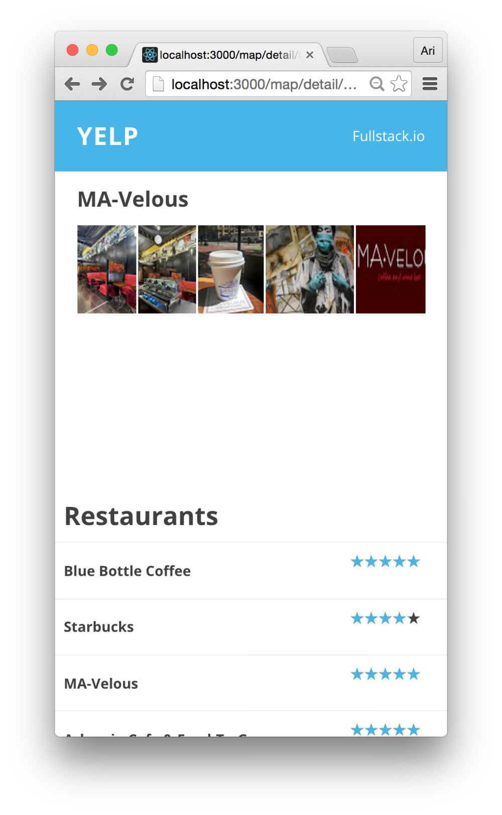
Refreshing our browser, we’ll see that our layout has completely
switched from horizontal to vertical. Adding a flex: 1 to
the content container balances out the sizing of the app in the mobile
view.
Now, if we expand the view back to desktop size, the vertical layout looks out of place and doesn’t quite work as well. Let’s add our first media query to fix this view on a larger screen.
First, we like to define our media queries by themselves. We
could add our custom media queries into the
base.css file, but it can clutter the styles as it grows
larger. Instead, let’s create a new file in
src/styles/queries.css to contain all of our media query
definitions.
touch src/styles/queries.cssIn this new file, we’ll use the @custom-media definition
to define the screen for phones vs. those which are larger:
@custom-media --screen-phone (width <= 35.5em);
@custom-media --screen-phone-lg (width > 35.5em);
Now, any screen that is relatively small can be targeted using the
--screen-phone media query and any larger screen can be
targeted using the --screen-phone-lg rule.
Back in our main styles css module, let’s apply the media query to
set the flex-direction back to column when we’re on a
larger screen.
/* In src/views/Main/styles.module.css */
.wrapper {
  overflow-y: scroll;
  display: flex;
  margin: 0;
  padding: 15px;

  height: 100vh;
  -webkit-box-orient: horizontal;
  -o-box-orient: horizontal;

  flex-direction: column;
  flex: 1;

  @media (--screen-phone-lg) {
    /* applied when the screen is larger */
    flex-direction: column;
  }
}
/* ... */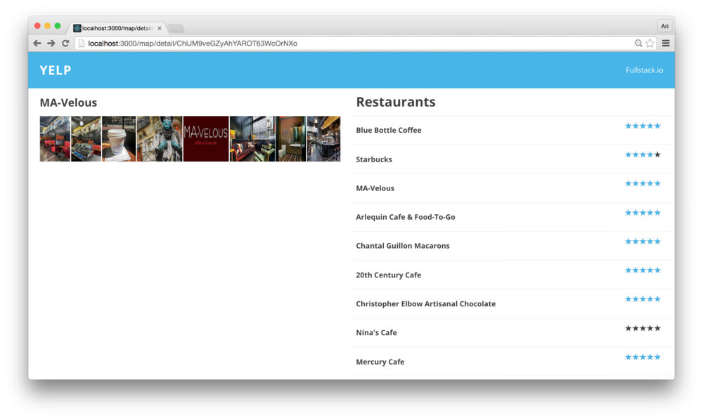
Now, both the content block and the sidebar are set side-by-side, but are both the same size. We can fix the ordering using the last rule we’ll discuss in-depth here.
The flexbox styling allows us to set the order of content blocks as
well in CSS. Currently, our content block and the
sidebar block are both set to be ordered first, which
defaults to showing the content block that is defined first initially.
To modify the content block so that it is defined first on mobile and
last on desktop, we’ll apply the CSS rule of order.
/* In src/views/Main/styles.module.css */
.wrapper {
  overflow-y: scroll;
  display: flex;
  margin: 0;
  padding: 15px;

  height: 100vh;
  -webkit-box-orient: horizontal;
  -o-box-orient: horizontal;

  flex-direction: column;
  flex: 1;

  @media (--screen-phone-lg) {
    /* applied when the screen is larger */
    flex-direction: column;
  }
}
.content {
  position: relative;
  top: var(--topbar-height);
  left: 0;

  flex: 1;
  order: 1;

  @media (--screen-phone-lg) {
    flex: 2;
    order: 2;
  }
}
/* ... */
In order to set the sidebar to play nicely with the rest
of our content box, let’s apply the same principles of ordering and flex
to the sidebar (except in reverse):
@import url("../../styles/base.css");
@import url("../../styles/queries.css");

.sidebar {
  /* ... */

  flex-direction: column;
  order: 2;
  flex: 1;

  @media (--screen-phone-lg) {
    display: block;
    flex-direction: row;
    order: 1;
  }

  .heading {
    /* ... */
  }
}
Back in the browser, refreshing the page, we’ll see that the layout looks even at either mobile or larger.
One final note before we end our app, when our user visits the page for the first time, they’ll end up at a blank page. This is because we haven’t defined an index route.
We can handle an index route in a few different ways. We’ll set our
Map component as the index route using react router’s
<IndexRoute /> component. Back in
src/views/Main/routes.js, let’s set the index route:
import {Route, IndexRoute} from 'react-router'
// ...

export const makeMainRoutes = () => {

  return (
    <Route path="" component={Container}>
      <Route path="map" component={Map} />
      <Route path="detail/:placeId"
            component={Detail} />

      <IndexRoute component={Map} />
    </Route>
  )
}
Refreshing the page and navigating to the root at
http://localhost:3000, we’ll see we no longer have a blank
page, but the main route of our app with the map and sidebar showing
pages.
We walked through a complete app with a large number of routes, complex interactions, concepts, and even added responsiveness to the app.
We’ve placed the entire app on github at fullstackreact/yelp-clone.