By Theo Rosendorf on August 15, 2019 | Link
In this golden age of the viewport I am amazed by the lack of care given to typesetting. Every day we see badly spaced type left unfinished. To be fair, some designers are stuck when faced with something like a bad letter pair. Maybe they can”t edit a font or don”t know how to code. I do fear though that such mishaps often go unnoticed. In my experience, laypeople know when typesetting isn”t right but they never think of it as something that can be fixed. They just suffer through it and call it good. But dearest graphic designers — our brothers and sisters who pride themselves on having the most undying typographic loyalty — who bandy about all the usual terms like kerning, tracking, whitespace, but never actually apply any of it … Guys, we gotta talk.
The tools are there. The knowhow, should be there. By all accounts though, typographic consideration for the screen is still pretty low.
Following are some little fixes for what I consider major oversights. I file these under what most designers say they care about deeply, but never actually do anything about in practice.
[Of course it doesn”t help that we usually have programmers doing
typesetting these days but that”s an altogether
separate topic.]
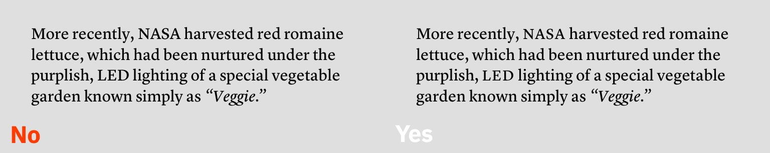
For body text and small titles, adding space to strings of capitals makes them more readable. I rarely see this done. And that”s a shame because it can really improve the reading experience when done right. Cap strings on their own are disruptive to the reading line. This is because they”re read more as individual letters than words. As we run across them, reading slows for each letter. Adding space makes them more readable. And in the absence of smallcaps – or as another option to smallcaps – slightly reducing their size can make them more agreeable on the line.
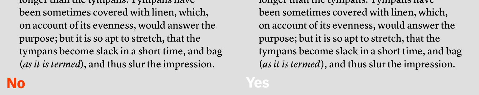
No font is perfect and most fonts have spacing issues. It really can”t be helped since there are literally thousands of possible letter pairs. Always look out for the un-kerned, they”re everywhere. The best place to adjust these are in the font, but if you can”t do that, you”ll have to fix them in the page. Of course letter pairs across styles (italic/roman) can”t be kerned across two separate fonts so those too have to be adjusted manually in the page. Look for collisions common with italics against roman closing punctuation.
No one does this. Maybe for a static title here and there, but not much past that. These sorts of spacing issues are often just accepted. But if you can see them, why allow such obvious errors go unfinished?

For the top offenders, here is Simon Cozens” top 50 most commonly left un-kerned glyph pairs (from a much larger list of ten-thousand across 514 fonts). An immensely useful list. Thanks Simon!
| LT | LV | LY | TA | P, |
| Ta | VA | T. | AV | Yo |
| Ya | PA | YA | To | T, |
| P. | F, | AY | V. | Va |
| F. | AT | Te | Vo | LW |
| Y. | Ye | Y, | FA | V, |
| Ve | TÆ | Yu | WA | L” |
| T- | AW | Wa | Tœ | v. |
| y. | w. | W. | Tw | Tæ |
| VÆ | Wo | PÆ | r. | v, |
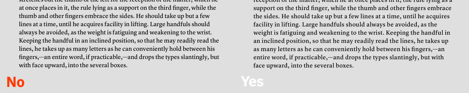
Super small text (< 10px) needs added letter spacing throughout, especially when reversed light on dark. Slightly spaced text makes it appear larger and less cramped without noticeably changing its structure. Also legibility is made worse when small type is set light on dark because reversed text always appears more bold, and in this case more cramped.
The Goudy quote “Anyone who would letterspace blackletter would fuck sheep.” is an oversimplification at best. Even blackletter needs letterspacing at tiny sizes. So, we should hope that even the great Goudy fancied sheep every once in a while. 🐑
Richard Rutter | October 17, 2017 | Link
When it comes to numbers we have just ten digits. Throw in a comma and a period and we’ve got grand total of twelve characters. You might not think that would present much of a challenge to a typographer, but to a professional typesetter (that’s you if you’re a designer) numerals require far more nuance and variation than you might think at first glance. Numbers deserve the same care and attention as text – this excerpt reveals the numerical situations you should be looking out for, and how to tackle them to benefit your reader.
In ‘Ligatures and abbreviations’ we established that writing systems based on the Latin alphabet, in addition to Greek and Cyrillic, use a bicameral script, with each letter represented by two different forms – uppercase and lower (or majuscule and minuscule, to use more formal terms). The same is true of numerals. We have at our disposal ‘uppercase’ numbers 0123456789 called lining or titling numerals, and ‘lowercase’ numerals 0123456789 called old-style or text numerals.
Unlike capital and lowercase letters, different forms of numbers do not convey different meanings; they are, however, an essential component of the typographer’s palette. Just as a string of capital letters in the middle of a sentence SHOUTS at your reader, so numbers set in lining numerals call undue attention to themselves. Are pounds, dollars, dates and quotas really more important than the words and ideas which give them context and meaning?
Treat numbers as you would letters, making sure they don’t stand out unnecessarily. Do this by using old-style numerals in all your running text. Most modern, professional fonts will include both old-style and lining numerals as OpenType features. One or other of these styles will be used for the default numbers. More often it will be the old-style numerals, but there is no strict rule or consistency, and the choice of default is down to the type designer.
It’s also the case that the vast majority of fonts are neither modern nor professional, if modern means OpenType-enabled and professional means designed with both sets of numerals. Take Georgia, for example. Designed by Matthew Carter in 1993 as a screen font for Microsoft, it is extremely well put together, elegant and appealing, and one of the most popular and widely distributed fonts in the world. But it is not packaged as an OpenType font and so only contains one set of numbers, in this case old-style numerals. Times New Roman, which is similarly widespread but, again, not as an OpenType font, is packaged only with lining numerals. Georgia and Times New Roman are so widely distributed because they are bundled free of charge with Windows and Mac operating systems. However, both these fonts – like many others – are available to buy in professional versions, which do come as OpenType fonts complete with both sets of numerals, small caps and many other features.

To specify old-style numerals, set the
font-variant-numeric property with a value of
oldstyle-nums. If most of what you’re designing on a page
is running text, then your best approach is to set old-style numerals so
that they are inherited from the <body>.
body {
    font-variant-numeric: oldstyle-nums;
}
For legacy browsers requiring font-feature-settings, use
the onum OpenType feature tag. As explained in ‘Ligatures
and abbreviations’, you can add an @supports rule to cater
for legacy browsers that only support
font-feature-settings:
body {
    font-feature-settings: "onum" 1;
}

@supports (font-variant-numeric: oldstyle-nums) {
    body {
        font-feature-settings: normal;
        font-variant-numeric: oldstyle-nums;
    }
}
Many sans serif fonts of the early to mid-twentieth century, including Helvetica, were never designed with anything other than lining numerals. This is one of the reasons why Helvetica is rarely your best choice for body text. That said, the lining numerals are less of a problem in Helvetica than they are in some other typefaces. As we saw in ‘Designing paragraphs: line spacing’, Helvetica has a large x-height. A consequence of this is that its lowercase letters are closer in stature to its lining numerals when compared to other sans serif fonts such as Futura and Avenir, which have far smaller x-heights.

Clearly Paul Renner and Adrian Frutiger, the designers of Futura and Avenir respectively, recognised the need for old-style numerals in their fonts as both these typefaces were designed with them from the start. Sadly, the versions of Futura and Avenir widely distributed with Apple devices have lining numerals as the default, and do not include old-style numerals as OpenType features (the macOS version of Avenir Next, however, does include them).
Old-style numerals are your go-to glyphs for making numbers sit well in running text. For the same reason they are at ease with lowercase letters, so old-style numerals feel uncomfortable in close proximity to capital letters. If you set headings in anything other than sentence case, in particular ALL CAPS, or Title Case, then don’t use old-style numerals. Lining numerals will sit far more naturally in the company of uppercase letterforms.

On those occasions when numbers are the star attraction, lining
numerals are the way to give them the attention they crave. Old-style
numerals have a wavy rhythm to them, with some numbers reaching upwards
towards the capitals, some squatting at the x-height, and others ducking
down below the baseline: 1234567890. This is why they work so well in
continuous reading – they replicate the patterns of words in running
text. However, if your reader is scanning a sequence of numbers, looking
for patterns, making comparisons, or hunting for data in a list, table
or other setting, they will find it far easier to do so with the
familiarity and evenness of lining numerals. To specify lining numerals,
set the font-variant-numeric property with a value of
lining-nums:
h1 {
    font-variant-numeric: lining-nums;
}
For legacy browsers requiring font-feature-settings, use
the lnum OpenType feature tag.
Subscripts and superscripts are tiny numerals which are lowered or
raised. They are used in chemical and mathematical formulas, as footnote
indicators, and other specialist situations. For example:
‘Caffeine1 is
C8H10N4O2.’ Mark this up
meaningfully in HTML using the <sup> and
<sub> elements:
Caffeine<sup>1</sup> is C<sub>8</sub>H<sub>10</sub>
N<sub>4</sub>O<sub>2</sub>.
Browsers’ default styling for <sup> and
<sub> is to take a regular numeral, make it a bit
smaller, and raise or lower it accordingly:

This works fine up to a point, but the numerals are still a little too big aesthetically and they affect the line spacing, causing unevenness in the rhythm:

Most professional fonts contain properly designed subscripts and superscripts built in as OpenType features. These numerals are smaller and squatter than regular numbers, and because their position relative to other characters is part of their design, the line spacing is unaffected:

To use proper subscripts and superscripts, use the
font-variant-position property, like this:
sub { font-variant-position: sub; }
sup { font-variant-position: super; }
Unfortunately, this still leaves us with a problem: the browser’s default styling is still applied. Our special subscript character is being made smaller and it’s getting moved downwards, affecting the line spacing:

The styles the browser applies to our subscript characters are these:
vertical-align: sub;
font-size: smaller;
We need to remove those styles to get the desired effect, so our rule now becomes:
sub {
    vertical-align: baseline;
    font-size: inherit;
    font-variant-position: sub;
}
That will work fine for browsers that support OpenType. But browsers
that don’t will get C8H10N4O2, a degraded rendering compared with the
browser defaults. To address this we can use an @supports
rule to check if the browser supports font-variant-position
and only override the browser’s default <sub> styling
if that’s the case:
sub { font-variant-position: sub; }

@supports ( font-variant-position: sub ) {
  sub { vertical-align: baseline;
        font-size: inherit; }
}
For legacy browsers requiring font-feature-settings, use
the sups OpenType feature tag for superscripts, and
subs for subscripts. If we factor these in, we get
comprehensive, backwards-compatible style rules, but where two simple
properties should have done the job, we now have a far more verbose
proposition:
sub { font-feature-settings: "subs" 1; }

@supports (font-variant-position: sub) {
    sub { font-feature-settings: normal;
          font-variant-position: sub; }
}

@supports ((font-variant-position: sub) or (font-feature-settings: "subs" 1)) {
    sub { vertical-align: baseline;
          font-size: inherit; }
}sup { font-feature-settings: "sups" 1; }
@supports (font-variant-position: super) {
sup { font-feature-settings: normal;
font-variant-position: super; }
}
@supports ((font-variant-position: super) or (font-feature-settings: "sups" 1)) {
sup { vertical-align: baseline;
font-size: inherit; }
}One particular use of superscripts is for footnotes. When you reference notes using numbers, use true superscripts in the text but full-size numbers in the notes themselves.
While we’re on the subject of footnotes, it’s worth making a brief diversion into how the web improves their usability compared with the limitations of paper.
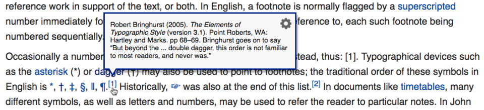
Many forms of writing, including academic papers, historical novels, detailed journalism and non-fiction books such as this one, contain additional citations, explanations and thoughts referred to within the text itself. A symbol is used to connect the note to the relevant location in the text. The symbols employed as references to annotations are either superscripted numbers or an esoteric series of devices starting with asterisks* and processing through daggers† to double daggers‡ and beyond.
Since the advent of mass printing in the Victorian era, the notes themselves have typically been positioned either at the bottom of the referring printed page (footnotes), or at the end of a chapter or the entire work (endnotes). However, this approach means the notes are located away from their position within the body of text. This can disturb the reader who wishes to refer to the annotation as they proceed through the text. The connected point in the text may well be halfway through a sentence in the middle of a paragraph at some point higher up the page, or on a different preceding page altogether, and attempting to return to it disrupts the reader’s rhythm.
An earlier approach by medieval scribes and Renaissance printers placed notes in the margins (side notes) rather than at the bottom of the page. By including notes as marginalia, the annotations are present where needed and can be read with little more than a glance away from the main text.

Although side notes are an improvement on footnotes, both solutions are designed within the confines of the two-dimensional printed page. The web is an interactive medium and provides us with at least three dimensions in which to work, implying you can use the z-axis to place the note on top of the main text.
Enable your reader to reveal the note on demand in the very place they are reading. Put simply, link to the footnote using a conventional symbol, but have it pop up in the vicinity of the link, thus providing a thoroughly modern solution impossible within the limitations of a printed page.