Recently I was working with a client to train their internal teams on how to build web applications. During this process it occurred to me that the way we presently architect the front-end is very strange and even a bit broken. In many instances you’re either copying huge chunks of HTML out of some doc and then pasting that into your app (Bootstrap, Foundation, etc.), or you’re sprinkling the page with jQuery plugins that have to be configured using JavaScript . It puts us in the rather unfortunate position of having to choose between bloated HTML or mysterious HTML, and often we choose both.
In an ideal scenario, the HTML language would be expressive enough to create complex UI widgets and also extensible so that we, the developers, could fill in any gaps with our own tags. Today, this is finally possible through a new set of standards called Web Components.
Web Components are a collection of standards which are working their way through the W3C and landing in browsers as we speak. In a nutshell, they allow us to bundle markup and styles into custom HTML elements. What’s truly amazing about these new elements is that they fully encapsulate all of their HTML and CSS. That means the styles that you write always render as you intended, and your HTML is safe from the prying eyes of external JavaScript.
If you want to play with native Web Components I’d recommend using Chrome, since it has the best support. As of Chrome version 36, it is the first browser to ship all of the new standards.
Think about how you currently implement an image slider, it might look something like this:
<div id="slider">
  <input checked="" type="radio" name="slider" id="slide1" selected="false">
  <input type="radio" name="slider" id="slide2" selected="false">
  <input type="radio" name="slider" id="slide3" selected="false">
  <input type="radio" name="slider" id="slide4" selected="false">
  <div id="slides">
    <div id="overflow">
      <div class="inner">
        <img src="images//rock.jpg">
        <img src="images/grooves.jpg">
        <img src="images/arch.jpg">
        <img src="images/sunset.jpg">
      </div>
    </div>
  </div>
  <label for="slide1"></label>
  <label for="slide2"></label>
  <label for="slide3"></label>
  <label for="slide4"></label>
</div>
See the Pen CSS3 Slider by Rob Dodson (@robdodson) on CodePen
Image slider adapted from CSScience. Images courtesy of Eliya Selhub
That’s a decent chunk of HTML, and we haven’t even included the CSS yet! But imagine if we could remove all of that extra cruft and reduce it down to only the important bits. What would that look like?
<img-slider>
  <img src="images/sunset.jpg" alt="a dramatic sunset">
  <img src="images/arch.jpg" alt="a rock arch">
  <img src="images/grooves.jpg" alt="some neat grooves">
  <img src="images/rock.jpg" alt="an interesting rock">
</img-slider>
Not too shabby! We’ve ditched the boilerplate and the only code that’s left is the stuff we care about. This is the kind of thing that Web Components will allow us to do. But before I delve into the specifics I’d like to tell you another story.
For years the browser makers have had a sneaky trick hidden up their
sleeves. Take a look at this <video> tag and really
think about all the visual goodies you get with just one line of HTML
<video src="./foo.webm" controls></video>.
There’s a play button, a scrubber, timecodes and a volume slider.
Lots of stuff that you didn’t have to write any markup for, it just
appeared when you asked for <video>.
But what you’re actually seeing is an illusion. The browser makers needed a way to guarantee that the tags they implemented would always render the same, regardless of any wacky HTML, CSS or JavaScript we might already have on the page. To do this, they created a secret passageway where they could hide their code and keep it out of our hot little hands. They called this secret place: the Shadow DOM.
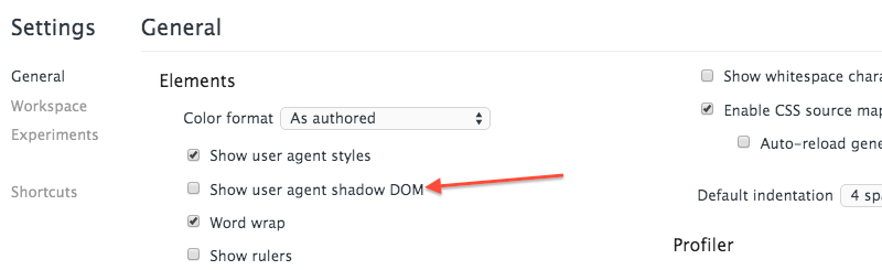
If you happen to be running Google Chrome you can open your Developer
Tools and enable the Show user agent shadow DOM flag.
That’ll let you inspect the <video> element in more
detail.
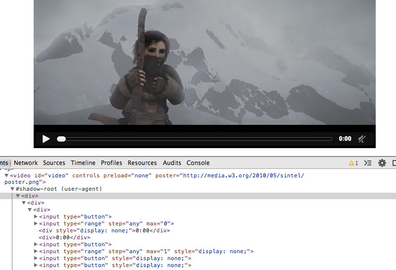
Inside you’ll find that there’s a ton of HTML all hidden away. Poke around long enough and you’ll discover the aforementioned play button, volume slider, and various other elements.
Now, think back to our image slider. What if we all had
access to the shadow DOM and the ability to declare our own tags like
<video>? Then we could actually implement and use our
custom <img-slider> tag.
Let’s take a look at how to make this happen, using the first pillar of Web Components, the template.
Every good construction project has to start with a blueprint, and
with Web Components that blueprint comes from the new
<template> tag. The template tag allows you to store
some markup on the page which you can later clone and reuse. If you’ve
worked with libraries like mustache or handlebars before, then the
<template> tag should feel familiar.
<template>
  <h1>Hello there!</h1>
  <p>This content is top secret :)</p>
</template>
Everything inside a template is considered inert by the browser. This
means tags with external sources—<img>,
<audio>, <video>, etc.—do not make
http requests and <script> tags do not execute. It
also means that nothing from within the template is rendered on the page
until we activate it using JavaScript.
So the first step in creating our <img-slider> is
to put all of its HTML and CSS into a <template>.
See the Pen CSS3 Slider Template by Rob Dodson (@robdodson) on CodePen
Once we’ve done this, we’re ready to move it into the shadow DOM.
To really make sure that our HTML and CSS doesn’t adversely affect the consumer we sometimes resort to iframes. They do the trick, but you wouldn’t want to build your entire application in ’em.
Shadow DOM gives us the best features of iframes, style and markup encapsulation, without nearly as much bloat.
To create shadow DOM, select an element and call its
createShadowRoot method. This will return a document
fragment which you can then fill with content.
<div class="container"></div>

<script>
  var host = document.querySelector('.container');
  var root = host.createShadowRoot();
  root.innerHTML = '<p>How <em>you</em> doin?</p>'
</script>In shadow DOM parlance, the element that you call
createShadowRoot on is known as the Shadow
Host. It’s the only piece visible to the user, and it’s where
you would ask the user to supply your element with content.
If you think about our <video> tag from before,
the <video> element itself is the shadow host, and
the contents are the tags you nest inside of it.
<video>
  <source src="trailer.mp4" type="video/mp4">
  <source src="trailer.webm" type="video/webm">
  <source src="trailer.ogv" type="video/ogg">
</video>The document fragment returned by createShadowRoot is
known as the Shadow Root. The shadow root, and its
descendants, are hidden from the user, but they’re what the browser will
actually render when it sees our tag.
In the <video> example, the play button, scrubber,
timecode, etc. are all descendants of the shadow root. They show up on
the screen but their markup is not visible to the user.
Any HTML and CSS inside of the shadow root is protected from the parent document by an invisible barrier called the Shadow Boundary. The shadow boundary prevents CSS in the parent document from bleeding into the shadow DOM, and it also prevents external JavaScript from traversing into the shadow root.
Translation: Let’s say you have a style tag in the shadow DOM that
specifies all h3’s should have a color of red. Meanwhile,
in the parent document, you have a style that specifies h3’s should have
a color of blue. In this instance, h3’s appearing within
the shadow DOM will be red, and h3’s outside of the shadow DOM will be
blue. The two styles will happily ignore each other thanks to our
friend, the shadow boundary.
And if, at some point, the parent document goes looking for h3’s with
$('h3'), the shadow boundary will prevent any exploration
into the shadow root and the selection will only return h3’s that are
external to the shadow DOM.
This level of privacy is something that we’ve dreamed about and worked around for years. To say that it will change the way we build web applications is a total understatement.
To get our img-slider into the shadow DOM we’ll need to
create a shadow host and populate it with the contents of our
template.
<template>
  <!-- Full of slider awesomeness -->
</template>

<div class="img-slider"></div>

<script>
  // Add the template to the Shadow DOM
  var tmpl = document.querySelector('template');
  var host = document.querySelector('.img-slider');
  var root = host.createShadowRoot();
  root.appendChild(document.importNode(tmpl.content, true));
</script>
In this instance we’ve created a div and given it the
class img-slider so it can act as our shadow host.
We select the template and do a deep copy of its internals with
document.importNode. These internals are then appended to
our newly created shadow root.
If you’re using Chrome you can actually see this working in the following pen.
See the Pen CSS3 Slider Shadow DOM by Rob Dodson (@robdodson) on CodePen
At this point our img-slider is inside the shadow DOM
but the image paths are hard coded. Just like the
<source> tags nested inside of
<video>, we’d like the images to come from the user,
so we’ll have to invite them over from the shadow host.
To pull items into the shadow DOM we use the new
<content> tag. The <content> tag
uses CSS selectors to cherry-pick elements from the shadow host and
project them into the shadow DOM. These projections are known as
insertion points.
We’ll make it easy on ourselves and assume that the slider only
contains images, that way we can create an insertion point using the
img selector.
<template>
  ...
  <div class="inner">
    <content select="img"></content>
  </div>
</template>
Because we are projecting content into the Shadow DOM using an
insertion point, we’ll also need to use the new
::content pseudo-element to update our CSS.
#slides ::content img {
  width: 25%;
  float: left;
}
If you want to know more about the new CSS selectors and combinators added by Shadow DOM, take a look at this cheat sheet I threw together.
Now we’re ready to populate our img-slider.
<div class="img-slider">
  <img src="images/rock.jpg" alt="an interesting rock">
  <img src="images/grooves.jpg" alt="some neat grooves">
  <img src="images/arch.jpg" alt="a rock arch">
  <img src="images/sunset.jpg" alt="a dramatic sunset">
</div>
This is really cool! We’ve cut the amount of markup that the user
sees way down. But why stop here? We can take things a step further and
turn this img-slider into its own tag.
Creating your own HTML element might sound intimidating but it’s
actually quite easy. In Web Components speak, this new element is a
Custom Element, and the only two requirements are that
its name must contain a dash, and its prototype must extend
HTMLElement.
Let’s take a look at how that might work.
<template>
  <!-- Full of image slider awesomeness -->
</template>

<script>
  // Grab our template full of slider markup and styles
  var tmpl = document.querySelector('template');

  // Create a prototype for a new element that extends HTMLElement
  var ImgSliderProto = Object.create(HTMLElement.prototype);

  // Setup our Shadow DOM and clone the template
  ImgSliderProto.createdCallback = function() {
    var root = this.createShadowRoot();
    root.appendChild(document.importNode(tmpl.content, true));
  };

  // Register our new element
  var ImgSlider = document.registerElement('img-slider', {
    prototype: ImgSliderProto
  });
</script>
The Object.create method returns a new prototype which
extends HTMLElement. When the parser finds our tag in the
document it will check to see if it has a method named
createdCallback. If it finds this method it will run it
immediately. This is a good place to do setup work, so we create some
Shadow DOM and clone our template into it.
We pass the tag name and prototype to a new method on the
document, called registerElement, and after
that we’re ready to go.
Now that our element is registered there are a few different ways to
use it. The first, and most straightforward, is to just use the
<img-slider> tag somewhere in our HTML. But we can
also call document.createElement("img-slider") or we can
use the constructor that was returned by
document.registerElement and stored in the
ImgSlider variable. It’s up to you which style you
prefer.
Support for the various standards that makeup Web Components is encouraging, and improving all the time. This table illustrates where we’re presently at.
But don’t let the lack of support in some browsers discourage you from using them! The smarties at Mozilla and Google have been hard at work building polyfill libraries which sneak support for Web Components into **all modern browsers**! This means you can start playing with these technologies today and give feedback to the folks writing the specs. That feedback is important so we don’t end up with stinky, hard to use syntax.
Let’s look at how we could rewrite our img-slider using
Google’s Web Component library, Polymer.
Polymer adds a new tag to the browser,
<polymer-element>, which automagically turns
templates into shadow DOM and registers custom elements for us. All we
need to do is to tell Polymer what name to use for the tag and to make
sure we include our template markup.
See the Pen Polymer Slider by Chris Coyier (@chriscoyier) on CodePen.
I find it’s often easier to create elements using Polymer because of all the niceties built into the library. This includes two-way binding between elements and models, automatic node finding and support for other new standards like Web Animations. Also, the developers on the polymer-dev mailing list are extremely active and helpful, which is great when you’re first learning the ropes, and the StackOverflow community is growing.
This is just a tiny example of what Polymer can do, so be sure to visit its project page and also checkout Mozilla’s alternative, X-Tag.
Any new standard can be controversial and in the case of Web Components it seems that they are especially polarizing. Before we wrap up, I want to open up for discussion some of the feedback I’ve heard over the past few months and give my take on it.
I think the thing that probably scares most developers when they first see Custom Elements is the notion that it will turn the document into one big pile of XML, where everything on the page has some bespoke tag name and, in this fashion, we’ll make the web pretty much unreadable. That’s a valid argument so I decided to kick the bees’ nest and bring it up on the Polymer mailing list.
The back and forth discussion is pretty interesting but I think the
general consensus is that we’re just going to have to experiment to see
what works and what doesn’t. Is it better, and more semantic, to see a
tag name like <img-slider> or is our present “div
soup” the only way it should be? Alex Rusell composed a very
thoughtful post on this subject and I’d recommend everyone take the
time to read it before making up their mind.
At this moment it’s unclear how well crawlers support Custom Elements and Shadow DOM. The Polymer FAQ states:
Search engines have been dealing with heavy AJAX based application for some time now. Moving away from JS and being more declarative is a good thing and will generally make things better.
The Google Webmaster’s blog recently announced that the Google crawler will execute JavaScript on your page before indexing it. And using a tool like Fetch as Google will allow you to see what the crawler sees as it parses your site. A good example is the Polymer website, which is built with custom elements and is easily searched in Google.
One tip I’ve learned from speaking with members of the Polymer team is to try to make sure the content inside of your custom element is static, and not coming from a data binding.
<!-- probably good -->
<x-foo>
  Here is some interesting, and searchable content...
</x-foo>

<!-- probably bad -->
<x-foo>
  {{crazyDynamicContent}}
</x-foo>

<!-- also probably bad -->
<a href="{{aDynamicLink}}">Click here</a>
To be fair, this isn’t a new problem. AJAX heavy sites have been dealing with this issue for a few years now and thankfully there are solutions out there.
Obviously when you’re hiding markup in secret shadow DOM sandboxes the issue of accessibility becomes pretty important. Steve Faulkner took a look at accessibility in shadow DOM and seemed to be satisfied with what he found.
Results from initial testing indicate that inclusion of ARIA roles, states and properties in content wholly inside the Shadow DOM works fine. The accessibility information is exposed correctly via the accessibility API. Screen readers can access content in the Shadow DOM without issue.
The full post is available here.
Marcy Sutton* has also written a post exploring this topic in which she explains:
Web Components, including Shadow DOM, are accessible because assistive technologies encounter pages as rendered, meaning the entire document is read as “one happy tree”.
*Marcy also points out that the img-slider I built in this post is not accessible because our css label trick makes it inaccessible from the keyboard. Keep that in mind if you’re looking to reuse it in a project.
Surely there will be bumps along the way but that sounds like a pretty great start!
Unfortunately <link> tags do not work inside of
the Shadow DOM, which means the only way to pull in external CSS is
through @import. In other words, <style>
tags are—for the moment—unavoidable.*
Keep in mind that the styles we’re talking about are relevant only to
a component, whereas we’ve previously been trained to favor external
files because they often affect our entire application. So is it such a
bad thing to put a <style> tag inside of an element,
if all of those styles are scoped just to that one entity? Personally I
think it’s OK, but the option of external files would be very nice to
have.
* Unless you use Polymer which gets around this limitation with XHR.
It’s up to us to figure out where these standards should go and what best practices will guide them. Give Polymer a shot, and also look at Mozilla’s alternative to Polymer, X-Tag (which has support all the way down to Internet Explorer 9).
Also, make sure you reach out to the developers at Google and Mozilla who are driving the bus on these standards. It’ll take our feedback to properly mold these tools into something we all want to use.
While there are still some rough edges, I think Web Components will eventually usher in a new style of application development, something more akin to snapping together Legos and less like our current approach, which is often plagued by excess boilerplate. I’m pretty excited by where all of this is heading, and I look forward to what the future might hold.
This article was peer reviewed by Mallory van Achterberg. Thanks to all of SitePoint’s peer reviewers for making SitePoint content the best it can be!
In a previous article I demonstrated how to create a multiselect web component. In the comments section of that article, readers touched on the very important subject of web component accessibility. Undoubtedly, for today’s web it’s vital to be accessible, so let’s talk about what accessibility stands for and see (by means of a real-world example) how to make a web component more accessible.
The code in this article will build upon the code from my previous article. You can grab a copy of it from our GitHub repo, or check out a demo of the accessible component at the end of the article.
When talking about the accessibility of a component we usually consider the following aspects:
Let’s discuss each aspect in a little more detail.
I’m sure you’ve heard about screen readers. A screen reader is a piece of assistive software that allows blind or visually impaired people to use applications by reading aloud information displayed on the screen. There are many screen readers out there, among them NVDA and JAWS for Windows, ChromeVox for Chrome, and VoiceOver for OS X.
When an element receives focus, the screen reader offers information
about it to the user. Thus when an HTML
<input type="text"> is focused the user knows from
the screen reader that they are dealing with text field (and can input
something). But if the element is just a bare <div>,
the screen reader has nothing to say about it.
To solve this issue we can use WAI-ARIA (Web Accessibility Initiative – Accessible Rich Internet Applications) to add special ARIA attributes to extend the semantics of the component markup. These additional semantics help assistive technologies to identify properties, relationships, and states in your user interfaces. The practical guidelines for using ARIA can be found here: WAI-ARIA Authoring Practices, alternatively (for a quick refresher) you could read our Introduction to WAI-ARIA.
The goal is to make it possible to interact with a component using only the keyboard. WAI-ARIA defines behavior and the keyboard interactions for many UI controls. To know which keys should be supported by which component, find the description of your component or a similar one in the specification and use that. For instance, the multiselect is similar to the combobox.
Even with keyboard accessibility in place, it’s good practice to let users know which keys/key combos to use to interact with the component (for example by providing some instructions in the application) since this might not be obvious.
Here we are talking about accessibility aspects related to the component’s appearance. Ensure that you can answer ‘yes’ to the following questions:
Remember, not all visually impaired users are legally blind. There are many users out there who (for example) have low vision or color blindness.
Now we’re going to make the multiselect more accessible using all of the techniques outlined above. Specifically, we’re going to:
Don’t forget, you can view the demo of the component at the end of the article, or download the code from our GitHub repo.
All of the code snippets can be found in the multiselect.html file.
The accessibility rule of thumb is to use native HTML elements over custom ones. This means, if you can use a native HTML control with built-in accessibility, do so. Add ARIA attributes only if you really need to create a custom component. If you’d like to find out more about this, read Avoiding Redundancy with WAI-ARIA in HTML Pages.
In our case the multiselect is a custom component, so we need to add ARIA attributes. First, let’s find a component similar to the multiselect in the ARIA specification. After a little research, it appears that the combobox looks and behaves similarly. Great, now let’s see which ARIA attributes we need to add according to the combobox description.
From guidelines we can see that we need to add the following roles:
role="combobox" to the root element of the
componentrole="listbox" to the list of items in the popuprole="option" to each item of the dropdown listThe aria state attributes to be added:
aria-expanded="true/false" to the root element to
indicate whether the component is opened or closedaria-selected="true/false" to each item of the dropdown
list to indicate selected stateThe roles combobox and listbox can be added
directly to the markup of the component:
<div class="multiselect" role="combobox">
  <div class="multiselect-field"></div>
  <div class="multiselect-popup">
    <ul class="multiselect-list" role="listbox">
      <content select="li"></content>
    </ul>
  </div>
</div>
To add the role option to each item of the list we loop
over items in the refreshItems method. This new method is
called when the component is rendered:
multiselectPrototype.render = function() {
  this.attachHandlers();
  this.refreshField();
  this.refreshItems();
};

multiselectPrototype.refreshItems = function() {
  var itemElements = this.itemElements();

  for(var i = 0; i < itemElements.length; i++) {
    var itemElement = itemElements[i];

    // set role and aria-selected property of an item
    itemElement.setAttribute("role", "option");
    itemElement.setAttribute("aria-selected", itemElement.hasAttribute("selected"));
  }
};

multiselectPrototype.itemElements = function() {
  return this.querySelectorAll('li');
};

The `aria-expanded` attribute can be added to the control in the `togglePopup` method which (as the name suggests) is responsible for showing and hiding the popup:

multiselectPrototype.togglePopup = function(show) {
  this._isOpened = show;
  this._popup.style.display = show ? 'block' : 'none';

  // set aria-expanded property
  this._control.setAttribute("aria-expanded", show);
};
We also initialize the aria-selected property of items
depending on their selected attribute. The
aria-selected property should be maintained to reflect the
current item’s selected state. We can do that in selectItem
and unselectItem methods:
multiselectPrototype.selectItem = function(item) {
  if(!item.hasAttribute('selected')) {
    // set aria-selected property of selected item
    item.setAttribute('aria-selected', true);

    item.setAttribute('selected', 'selected');
    this.fireChangeEvent();
    this.refreshField();
  }

  this.close();
};

multiselectPrototype.unselectItem = function(item) {
  // set aria-selected property of unselected item
  item.setAttribute('aria-selected', false);

  item.removeAttribute('selected');
  this.fireChangeEvent();
  this.refreshField();
};
And that’s it, the ARIA properties have been added. The next step is keyboard support.
Let’s open the specification and look at the Keyboard Interactions section to see which interactions we need to support.
Here is the basic set of keys to be able to use the multiselect with the keyboard only:
Alt + Up/Down Arrow – open/close the multiselectEsc – close the multiselectUp/Down Arrow – navigate through itemsEnter – select an item when multiselect is openedBackspace – unselect the last selected itemThe very first step towards adding keyboard support is to make a
component focusable. To do that we need to set the tabindex
attribute, whose behavior differs depending on the tabindex
value:
0 – the order of the element in keyboard focus
navigation is defined by the browser-1 – the element cannot be reached with keyboard focus
navigation, but can now receive focus programatically using JavaScript’s
focus() method.In the case of custom components, the tabindex should be
either -1 or 0, because we cannot know the
order of the element on the target page. Thus we set
tabindex on multiselect field to 0 directly in
the markup:
<div class="multiselect-field" tabindex="0" aria-readonly="true"></div>The next step is to handle the keydown event on the
multiselect:
multiselectPrototype.attachHandlers = function() {
  this._control.addEventListener('keydown', this.keyDownHandler.bind(this));
  ...
};
The keyDownHandler method calls the particular key
handler depending on the event.which property value:
multiselectPrototype.keyDownHandler = function(event) {
  switch(event.which) {
    case 8:  // Backspace
      this.handleBackspaceKey();
      break;
    case 13: // Enter
      this.handleEnterKey();
      break;
    case 27: // Escape
      this.handleEscapeKey();
      break;
    case 38: // Up Arrow
      event.altKey ? this.handleAltArrowUpKey() : this.handleArrowUpKey();
      break;
    case 40: // Down Arrow
      event.altKey ? this.handleAltArrowDownKey() : this.handleArrowDownKey();
      break;
    default:
      return;
  }

  // prevent native browser key handling
  event.preventDefault();
};
Once the key press is handled, we prevent the browser from carrying
out its standard action by calling
event.preventDefault().
The Alt + Down Arrow key combo should open the
multiselect, while Alt + Up Arrow and Esc keys
should close it:
multiselectPrototype.handleAltArrowDownKey = function() {
  this.open();
};

multiselectPrototype.handleAltArrowUpKey = function() {
  this.close();
};

multiselectPrototype.handleEscapeKey = function() {
  this.close();
};
The open and close methods just call the
togglePopup method:
multiselectPrototype.open = function() {
  this.togglePopup(true);
};

multiselectPrototype.close = function() {
  this.togglePopup(false);
};Firstly, we set the tabindex of each multiselect item to
-1, so they become focusable:
multiselectPrototype.refreshItems = function() {
  var itemElements = this.itemElements();

  for(var i = 0; i < itemElements.length; i++) {
    var itemElement = itemElements[i];
    ...
    // set item tabindex attribute
    itemElement.setAttribute("tabindex", -1);
  }

  // initialize focused item index
  this._focusedItemIndex = 0;
};
The _focusedItemIndex property stores the index of the
focused item.
Up Arrow and Down Arrow keys allow the user
to navigate over the items in the list maintaining the current focused
item index:
multiselectPrototype.handleArrowDownKey = function() {
  this._focusedItemIndex = (this._focusedItemIndex < this.itemElements().length - 1)
      ? this._focusedItemIndex + 1   // go to the next item
      : 0;                           // go to the first item

  this.refreshFocusedItem();
};
If the Down Arrow is pressed at the end of the list, the
focus goes to the first item.
If the Up Arrow is pressed on the first item of the
list, the focus goes to the last list item:
multiselectPrototype.handleArrowUpKey = function() {
  this._focusedItemIndex = (this._focusedItemIndex > 0)
    ? this._focusedItemIndex - 1        // go to the previous item
    : this.itemElements().length - 1;   // go to the last item

  this.refreshFocusedItem();
};
The refreshFocusedItem method sets focus to the item
with the index equal to _focusedItemIndex:
multiselectPrototype.refreshFocusedItem = function() {
  this.itemElements()[this._focusedItemIndex].focus();
};
Finally, we need to change the open and
close methods so that, when the multiselect is opened the
focus goes to the item with the index _focusedItemIndex,
and when the control is closed the focus goes back to the multiselect
field:
multiselectPrototype.open = function() {
  this.togglePopup(true);
  this.refreshFocusedItem();
};

multiselectPrototype.close = function() {
  this.togglePopup(false);
  this._field.focus();
};
Now we can add some CSS to make the focused item look visually more appealing:
::content li:focus {
  outline: dotted 1px #333;
  background: #efefef;
}The Enter key allows the user to select the current
focused item. If the multiselect is opened we get the focused item and
select it with selectItem method:
multiselectPrototype.handleEnterKey = function() {
  if(this._isOpened) {
    var focusedItem = this.itemElements()[this._focusedItemIndex];
    this.selectItem(focusedItem);
  }
};
The Esc key should remove the last selected item. If any
selected items are present, we take the last one and deselect it by
calling the unselectItem method:
multiselectPrototype.handleBackspaceKey = function() {
  var selectedItemElements = this.querySelectorAll("li[selected]");

  if(selectedItemElements.length) {
    this.unselectItem(selectedItemElements[selectedItemElements.length - 1]);
  }
};
Now we have supported all necessary keyboard interactions, so the component can be used with the keyboard only.
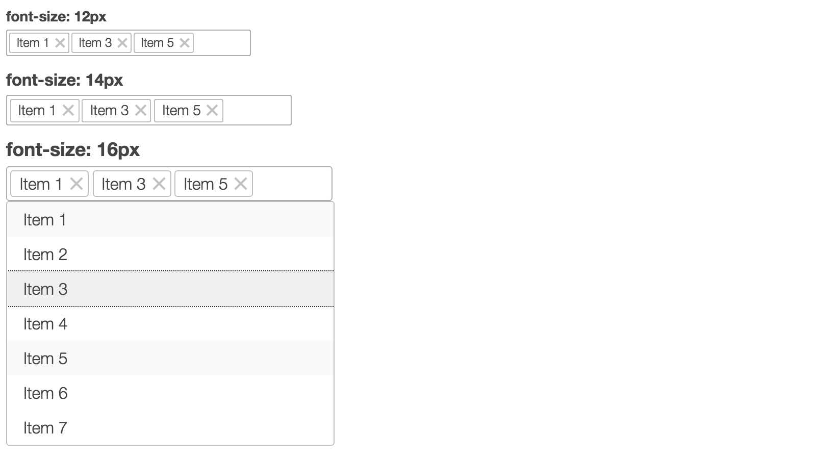
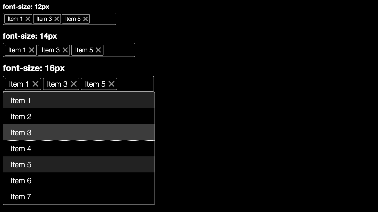
The multiselect has relative sizes in em and its size
depends on the font size of the container. Thus it’s scalable and can be
easily increased if necessary:
People with low vision or other visual disabilities sometimes use high contrast mode. OS X allows users to enable high contrast in the settings, whereas Windows provides special High Contrast Themes. There is also a popular Chrome extension called (surprisingly) High Contrast that allows users to browse the web with high contrast color filters.
Let’s see how our component looks in high contrast mode:
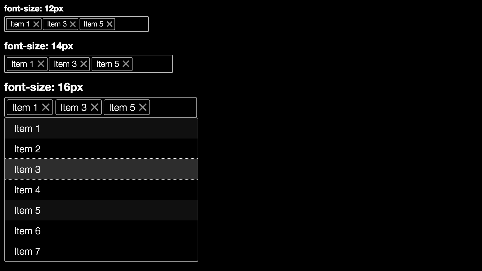
It looks ok, but there is an issue: the selected items are hardly distinguishable from the non-selected ones. A little change of color for selected and focused items fixes the issue:
Color accessibility is another important aspect of visual accessibility. There are many color-blind users exploring the web. This means that color should not be the only way to convey important information to the user. Here we can check how our component looks in grayscale mode (it’s usually provided by OS or special applications). Saying this, our component only consists of gray colors, so this is a check that we can skip.
Having implemented all of the above, this is the final product:
See the Pen Multiselect Web Component by SitePoint (@SitePoint) on CodePen.
To make a web component more accessible we need to be sure that:
tabindex. Implement
keyboard interactions following the ARIA practical guidelines.